UI&us is about User Interface Design, User Experience design and the cognitive psychology behind design in general. It's written by Keith Lang, co-founder of Skitch; now a part of Evernote.  His views and opinions are his own and do not represent in any way the views or opinions of any company. 

Navigation
Categories
External Articles

Wednesday
Jun022010

Jigsaw Junior — an iPad App for Kids

I wanted to share with you a little side project I've recently completed with a good friend. Jigsaw Junior for iPad (iTunes link) is a kid's jigsaw puzzle app we've just released — read more at the official Jigsaw Junior site here.


Definitely got a 'laundry list' of things to improve, so I'd love to hear your feedback to fill in the gaps.


Saturday
May152010

Unlike a Rolling Stone


John Gruber Linked to a BBC story on the Rolling Stones.

He adds his Gruberism to the end. 

So if you look at the history of recorded music from 1900 to now, there was a 25 year period where artists did very well, but the rest of the time they didn’t.

A keener business mind in the music industry you will not find.

I'd like to add my perspective.

Once upon a time,  I was a struggling musician. A gigging guitarist/keyboardist/electroguy, who happened to have both a formal music classical music degree under his belt, a reasonably thorough knowledge of the music industry, and at the same time the ability to barely make a cent out of it. Which, from my experience, is true for the majority of musicians. I've seen the music industry from a bunch of angles . Folk gig. Rock gigs. Touring. Written music for theatre. Been the 'world music guy' in a record store. Recorded, and been recorded in various forms of recording studios. Busking, jingles, choirs. Never got a contract. You get the idea. 

This was how musicians lived. Musicians scraped by. A paying gig at a wedding, a little spare pocket change in your hat. If you got lucky, you got an in-house gig writing for a King or a Lord. Or teaching harpsichord lessons to their kids. And this probably describes musicians' livings for the last thousands of years. Secular (rude songs to drink to) or Sacred (music for church so confabulated it needed to be written down), either end of the stick wasn't paying much.

And being a musician wasn't an easy gig. Even the likes of JS Bach, who had a pretty good full-time job with some rich guy, still spent one day a week ruling the lines on the paper. Talk about labour-intensive. And although Copyright law has roots back to 1709, the great Mozart was buried in a paupers grave because his material was always being ripped off as fast as he could write it. Only much later would copyright, and therefor music-as-intellectual-property, become a source of income for musicians.

Image from Wiki Commons

The ubiquity of the piano in the 1800's onwards created a sheet music market. From 1890 onwards we saw the birth of the recorded audio market. It's counter-intuitive to think that opera was one of the driving forces behind the success of the 'record'. Next up came mass media in the 40s and 50s, and before you knew it, The Rolling Stones were rolling in it. And so was their record company.

Mick Jagger is quoted as saying:

Then, there was a small period from 1970 to 1997, where people did get paid, and they got paid very handsomely and everyone made money. But now that period has gone.

See, the Recording Industry was optimized for 'hits'. You couldn't just record everyone, that was expensive. You got economies of scale producing a single thing. Besides,  you couldnt promote everyone on the radio, there was limited airtime and stations to do that in. And you certainly couldn't stock everyone's records in a record store, there just wasn't enough shelf space. Their business model works best when there's one record by one artist that everyone is buying. Or something approaching that.

The standard approach to achieve this was to sign up a selection of artists, and cut them a crappy deal. The public doesn't realise that a Recording Contract is essentially a loan where the bank decides how you'll spend your money. Most albums lost money. But the rare few made up for it. Like the Rolling Stones.

Then things changed.

Digital technology made it incredibly cheap to record a high quality album (and video clip if you wanted one). Then, the iTunes store etc. made it possible to stock an infinite number of artists. And the internet made it possible to promote and deliver the work of any obscure artist to anyone else in the world. Yay!

OK, so Mick Jagger can only afford slightly shorter lines of coke. But I believe there are now 10,000x more musicians and artists, everyday making their living from their '1000 true fans'. And that rings true for Interaction Designers, Developers, Graphic Designers etc too. I make my living because of Teh Internets and technologies like forums, Skype, Instant Messaging, websites, e-commerce and the like. And it's not just me — I've worked with people in Japan, Austria, Switzerland, France. It's people across the world who are experiencing this revolution.

Case in point: I've got a developer friend here in Australia who just completed an iPad application with the help of a graphic artist. In Russia. And here's a pic from the Swiss Alps with my good friend, and one of the Skitch developers Adrian. A (great) musician by coincidence. You may be surprised to know where that piece of software under your fingertips has come from.


This is the world I, and so many of us in the tech world, now live in. Culture and opportunies cross borders that they didn't before. The democratisation of industries. Don't listen to Mick. This is a wonderful time.


Saturday
Mar272010

Colour Me Subtle

Here's the segmented control section from iMovie '09.

Bit of a surprise — I'd not noticed the subtle colouring of two of the icons before. 


Friday
Mar192010

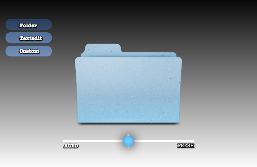
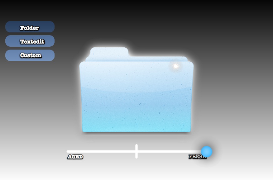
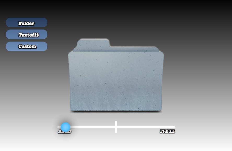
Ageing Icons with Freshness App

I've previously written about the idea of visually ageing files and folders. The aim is to provide more metadata to the user visually—which of these folders did I just put here? What's been here a long time and really needs to be filed?

In the spirit of Getting Real I've made a quick mockup app called 'Freshness' to demonstrate how these 'ageing' and 'freshness' affects might be programatically applied to any icon.

You can download the Freshness app for free and have a play. I'd love to hear your feedback. Please note that Freshness.app requires Mac OS 10.6 Snow Leopard.

Are the effects too strong, or too subtle? Does this provide real value, or is it just novelty? How else can 'age' and 'freshness' be visually displayed? 


Credit: Original Folder Icon by Guifa. 'Custom' Application icon by Sebastiaan De With. Made with Quartz Composer and turned into an Application with Kineme's QuartzBuilder.

Saturday
Mar062010

Multitouch Art, Sand to Silicon

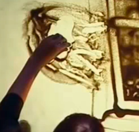
My Dad sent me this video today. Apparently it's been doing the rounds since 2009 but I'd not seen it. The video is from the TV show Ukraine's Got talent and contains eight and a half minutes of astounding 'sand animation' by Kseniya Simonova.

Take a little break and watch the performance of 'The Great Patriotic War' here. Link to large size video, which I recommend. 8:30 long.

There are three exceptional things about this video. One — it's great art — enthralling performance, emotional themes, beautiful imagery. Secondly, the performance itself is technically amazing, yet, apparently the artist has only been doing this for one year. Finally, all of this is being achieved with some plain sand on a flat (backlit) surface. The tools for art don't get much simpler.

And yet…this is exactly the type of real-time, subtle, organic, sensual and fast art I always imagine computers could be capable of. Unlike many swooshy multitouch demos, this is not art for art's sake, instead the animation covers very human topics; one of every four people in the region died in WWII's Eastern Front. And she's using every last creative aspect of sand, from brushing, to finger and palm painting, throwing sand and scraping with the edge of her palm.

Two Hands are Better Than One

So this is how great it can be with some sand. How about some silicon? Matt Gemmell wrote a great piece on iPad application design I enjoyed. On the topic of the iPad's large, multitouch area, he writes…

The important point is that there are other, more obvious ways to accomplish these things; the two-handed input features are conveniences and power-user features. They’re useful and time-saving and possibly discoverable, but they’re not the only way to accomplish those tasks. We’re only just beginning to come to terms with the possibilities of dual-handed input; essential functionality shouldn’t require it yet.

You can see in the video that Kseniya rarely uses two hands. My stopwatch recorded only 1:15 minutes of two-handed use in the eight-and-a-half minute performance. That is, she only uses two hands simultaneously in this performance — 15% of the time. When she does, it's to do something quickly like clear an area. She also seems to use two hands when she's wants to draw symetrically, like the hair at 3:43.

 The matter is not that simple though. Many times she switches hands in the performance because she wants to draw on the far left (she appears right-handed) or because she wants a particular shape, or needs to approach from a particular side. 

Sometimes she switches for speed, and artistic effect; alternating left and right throws.


Just the Tip(s) of the Iceberg

I love this video because of the richness in the interaction. It's an encyclopaedia of gestures, from a single finger-painting, to multi-finger dabbing, parallel lines with thumbs and middle-inger. French-curve arcs with a palm, broading erasing strokes with the whole hand and intricate air-brush effects with sand released from above. I agree with Matt: we are at the beginning of this whole wonderful adventure. I'm going to keep Kseniya performance in mind as something to strive for. This is a great interface. 


Saturday
Mar062010

Apple Trademarked "Multi-Touch"

Apple's press release announcing iPad availability contains the following:

iPad’s revolutionary Multi-Touch™ interface makes surfing the web an entirely new experience…


That's Multi-Touch (TM). I'm amazed it's possible to trademark that.

Friday
Feb262010

Anyone Serious about Software…

I love Omni's commitment to iPad software design by making their own hardware prototypes. To paraphrase Alan Kay:

People who are really serious about software mockups should make their own hardware mockups.

Thursday
Feb182010

Can't Read URLs Some People

This post is a reply to "Some People Can't Read URLs' by Jono of Mozilla. 

The backstory is as follows: ReadWriteWeb had published a piece about Facebook. Through the magic of PageRank, this page became the top Google listing when you searched for "facebook login". Here's the unexpected bit: comments started pouring in declaring this new Facebook redesign to be terrible from people who thought the ReadWriteWeb page WAS Facebook. Some viewers of this saga took this to be a display of the utter stupidy of the majority of Facebook users. Others interpreted it as a demonstration that technology was poorly designed. To my understanding, Jono's piece breaks the problem down into a dichotomy between a simple web for simple users, VS a web with educated users. The solution he proposes would involve educating users about URLs, to result in the latter. I don't quite agree.

I like education. It's a wonderful, empowering, liberating thing. I also like stories. Let's start with one of them.

Twinsong

The year was 700AD. The Angles and the Saxons had been living in Britain for a while, having migrated over from Germany. Apparently everyone forgets about the Jutes. They were there too. But we'll forget about them. Anyway, this bunch spoke their own language: Anglo-Saxon. Though it laid the foundations for modern English, some fundamentals differed;

[From a truly excellent course guide on the history of Anglo-Saxon by Professor Michael D.C. Drout. I highly recommend listening to the Audible version for it's out-loud Anglo Saxon]

In Anglo-Saxon, you could say “dog cat ate,” “ate cat dog,” or “dog ate cat” and still not tell your reader who did the eating and who got eaten. Instead of relying on word order, you would put a tag on who got eaten, so “dog ate cat-ne” and “cat-ne dog ate” and “cat-ne ate dog” would all mean the same thing and would be different from “dog-ne ate cat” or “cat dog-ne ate” (whoever gets the –ne is the one who gets eaten).

Got it? OK. A hundred years later, the Vikings invaded, and stayed. Things got confusing for a while with the Danish and Norwegian native languages intermingling with Anglo-Saxon. Later the French rocked up. Bah. What a mess. Jump in your DeLorean, punch in 2010, and —sssSPOW!— we find that English now uses word order, not tags, to define whom ate who. Dog ate cat. Not cat-ne ate dog. Point being that unless you know the rules, it can be very confusing.

Let's continue the story here in the modern era. I remember Tech journalist Leo Laporte* telling the following story…

Leo wanted to share with his wife his newly created streaming tech-news site. I'm sure he must have been bursting with pride of his accomplishments of duplicating the functionality of a multi-million dollar broadcast station in a single room in his cottage. He instructed his wife to visit live.twit.tv to enjoy the fruits of his labour. But, she accidentally typed into her browser something not quite right — twit.live.tv. After seeing the result she demanded an explanation. I can tell you the site she found is Not Safe For Work and doesn't contain in-depth comparisons of iPad vs the Kindle book reader.

Same problem, different millennium. 

The URL bar seems to me to be the last bastion of CLI that the average joe is forced to deal with. All these slashes and dots. Get one letter or dash wrong, order some words around and it all goes to hell. So, users give up and just type into Google. 

So what the heck does the URL actually do, from a UX perspective?

  1. Lets you go to a particular place on the web by typing something in
  2. Tells you where you are, for example if you've been clicking links and find yourself on a new page, or site
  3. Provides a secure 'where am I' information. If you're browsing in the Western World, facebook.com usually means you're at facebook.com

Now I don't know much about networking. I haven't been following browser/ HTML5/DNS debates. BUT what I do know is that URLs are a weak point in the user experience. In the words of MC Hammer, breakitdown… 

  1. Lets you go to a particular place on the web by typing something in

Bit of a fail here, as we've already discovered above. One of the problems is that the semantics are not understood by average punters.

How about we have the browser help?
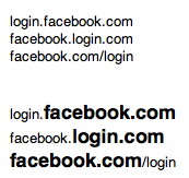
 

 The important stuff is big and bold. Much more could be done. Props go to the Mozilla team for the Awesome bar, which is forging ahead in usability. 


2. Tells you where you are, for example if you've been clicking links and find yourself on a new page, or site

Fail, because people aren't watching/noticing. I really like the little icons that appear next to the URLs — favicons. I'd love a bigger version. How about we colour the chrome of the browser with it? Facebook uses 'you're leaving Facebook.com' dialogue boxes to let people know they're going out in the Wild West. Effective, but clunky.


  3. Provides a secure 'where am I' information

Smells like a Pareto Paradigm to me: 

  • Many people, not just a few (hence the newsworthiness of the story) are accidentally visiting the wrong site
  • There's very few popular browsers that many use: Firefox, Chrome, Safari, IE, Opera.
  • Of all the web's sites, there's a few that many non-savvy surfers use: Facebook, Myspace, Hotmail, GMail, Yahoo, Ebay, Amazon

It follows that the big browsers could have a whitelist for sites they know non-savvy users would be visiting and show some warning for sites that look like they're trying to pretend.

As for Verified sites: Firefox is doing the best job of the browsers I use, showing that a site is verified. FF displays a large green button for 'verified'. But that only means something if you're expecting it to appear. Classic UX design problem: If you don't know, (or forgot) that it's supposed to be there, you won't notice when it's not.

How about a standard symbol that would appear in a browser that a page could reference "you should be seeing this symbol"? Or some better specification for integration between the browser and the secure site itself. 

You May Argue

"It's not that complex to learn how a URL works!"

Ever seen someone double-click on a link to 'open' it? They learnt to double-click on desktop icons in order to open them, and are now applying that rule to the web. And here's the problem: there's a lot of arbitrary technicalities in computing that the users are being asked to learn about. I'm all for the education that Jono suggests. But general, reusable knowledge. Not the inner gears and ratchets of a mechanism conceptually born two decades ago that we call the World Wide Web. 

"If we hide the guts of the internet away from the average user, won't they become docile clueless consumers?" "One day they'll find themselves locked into some DRM encrypted, Apple/Microsoft/Google-only internet."

I like the way Google Reader handles this. The average user may not know anything about RSS, or where to find the appropriate RSS link. Instead, they just plonk the site into Google Reader and it works out the appropriate RSS URL for itself. The RSS standard is not compromised.

"If the user isn't savvy enough to see the huge ReadWriteWeb banner, how are they to notice anything more subtle? AKA "what hope is there for these losers?"

The perceived complexity of the URL bar is a self-fufilling prophecy to failure. People don't understand it, so they don't use it, so they don't notice when it displays something different to what they should expect. 


* Interestingly, http://www.leolaporte.com/ is hijacked. If the 'president of the internet' doesn't have a URL, what faith can we have in URLs at all?

 ** Bonus points to anyone who gets the Twinsong reference to the stories

Friday
Feb122010

Creator of the Mac Startup Sound

OMT in San Francisco #3: 'Let it beep' from One More Thing on Vimeo.

Video interview with Jim Reekes creator of that fat C chord boooooonnng.

NOTE: Introduction is in Dutch, interview in English. 

via @jasperhauser

Saturday
Jan302010

Daddy, What's a Mouse?

"Daddy, what's a mouse?"

"It's something that we used to point at objects on a computer screen"

"Just one thing at a time?"

"Yes honey."

"Wow! But how did you do this?"

[She resizes a square with two fingers and then touches the others to propagate the change]

"Well…in the past it was different. First you need to select all the objects you were interested in, by clicking in a space nearby, then dragging an imaginary rubber band around them all. If they weren't next to one another, then you needed to hold down Command on the keyboard while you clicked on each one. Then you would adjust the size of them with a separate control panel at the side of the screen. Or you might size one how you want, then press Command+C to copy, then Command+V to paste the squares…… are you listening?"

"No, sorry Daddy, that's all too technical for me. I don't know how you remembered all that in the old days!"


In the future, our children will all use rich multi-touch devices. They will look at the mouse & keyboard combination in the same way we today look at the Command Line Interface.