Some 6 months ago I asked the brilliant graphic artist Wolfgang Bartelme to help me out with a visual experiment. I had a visual idea that required subtley and an eye for detail, and if anyone could make it work, Wolfgang could. Before I explain the experiment, let me give you some of the thinking behind it.
Too Clean?
Computer interfaces usually present icons identically, which themselves are often gleeming like a freshly polished Porche showflow. The icons and graphics are so 'clean', so devoid of detail, that I wondered if us human-types were possibly missing out on subtle channel of information. We know which books at the library are read a lot — they've got dog-eared pages. We can tell the new books from the old, the frequently used, to the dusty unused. I wrote an earlier post on the topic of 'mess'. And of course, the idea of making a computer space more 'realistic' is not a new idea. But it certainly wasn't an idea that had caught on. Why?

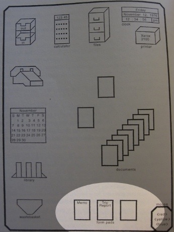
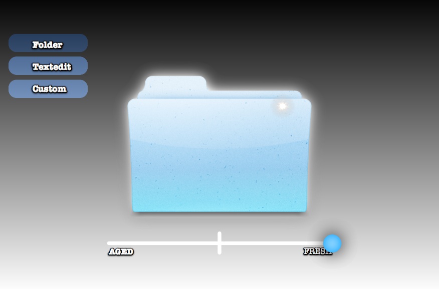
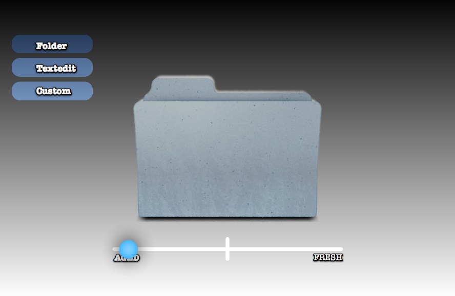
For example, no matter how new or worn, recently used or untouched, full or empty (on the Mac, at least), file folders look identical. I often search for my newly created folder amongst archaic, yet identical-looking icons.
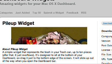
Many times a new Mac user has wondered why their disk is full. I need to explain that they have to empty the trash. They look surprised — there is no graphical difference between a little trash and a lot. For this reason I like the idea of the Pileup Dashboard Widget which piles up ugly looking junk as your trash fills up.
 Of course you may say "I use a computer to avoid ugliness like dirt and grime!" So the question is,:
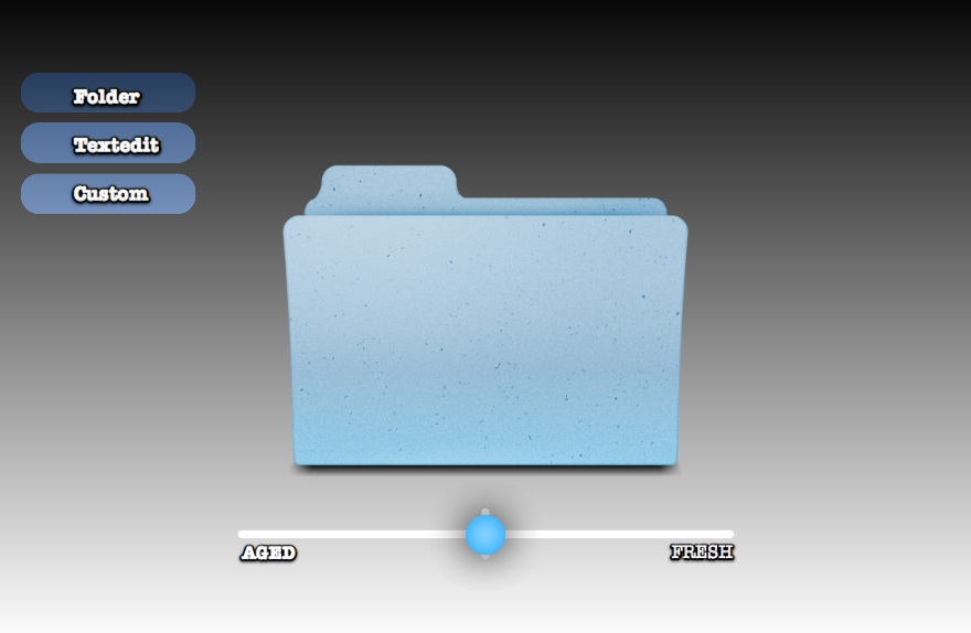
how beautiful and stylized could the characteristics of newness, age and usage visually look?
The perfect job for Wolfgang — if you're a Mac or iPhone user you've possibly come across his beautiful work. I asked him to illustrate:
- What if a folder or application was new?
- What if it was old, or really old?
- What if it lay untouched for some time?
- What if the object was taken away, what would remain?
The Results:

As you can see, Wolfgang iterated on standard Mac folders and an application icon to convey the different facets of each object. There will be many fans of Wolfgangs work who will enjoy the set of design iterations on this Skitch thread.
Some of the many arguments against adding more realism in this way:
- 'Why not use a different file view, like a list sorted by age?' This is true, as computers can do the filtering for us. And as you search, and learn more about the information space, you can formalise and add more filters as you go. For example "I remember it was in this folder…(click)…hmmm lots in here…I remember I used it last week…(click)… and the folder only had a few things in it…(click)…ah there it is." This is called facetted search.
- Perhaps it's not possible to make this many variables look 'pretty'. After all, the original Macintosh trash can had flies — which were removed for aesthetics before release, and there is a history of making clean, shiny, interfaces…perhaps with good reason.
- I contacted the eminent Cognitive Scientist Steven Pinker and asked him about this topic. He explained that while we're good at seeing single changing variables in a lineup (the reddest apple in the bunch), our ability to search declines when we search for a 'conjuntion' — the overlap of many variables like age, usage, size, etc. Perhaps this means a visually richer system would be cognitively expensive: no net gain
Was the experiment a success? Could this approach add real value, or just noise?
Click to read more ...

 Keith Lang