Ageing Icons with Freshness App
 Friday, March 19, 2010 at 11:33PM
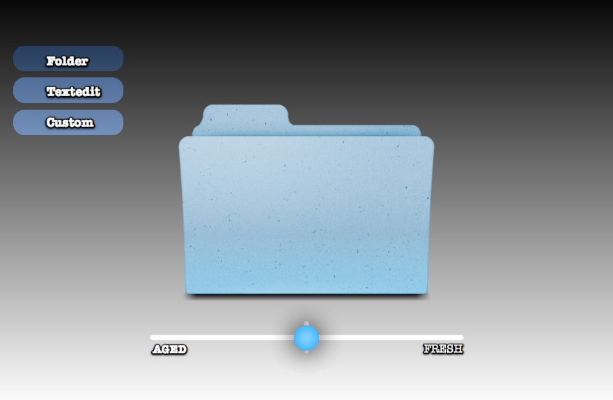
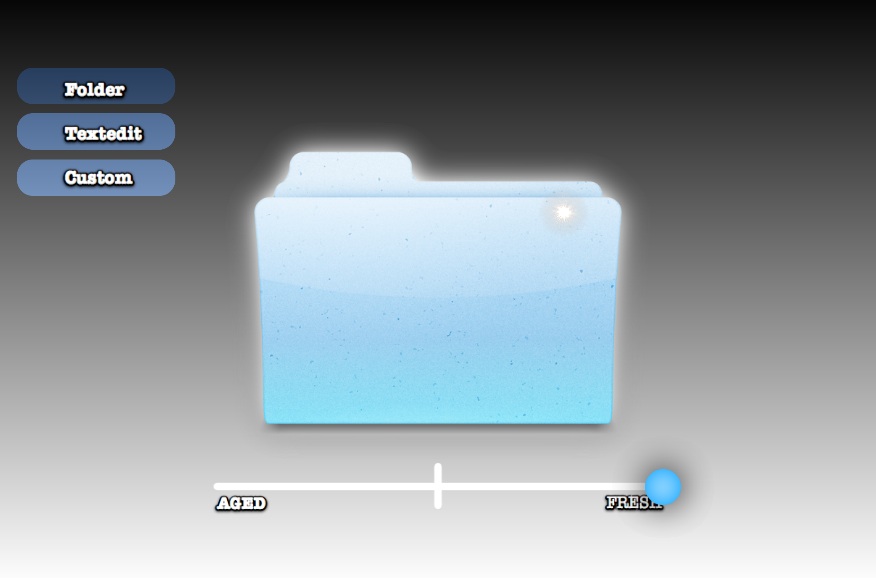
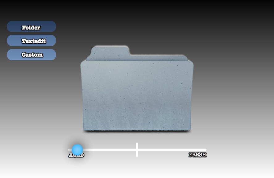
 I've previously written about the idea of visually ageing files and folders. The aim is to provide more metadata to the user visually—which of these folders did I just put here? What's been here a long time and really needs to be filed?
In the spirit of Getting Real I've made a quick mockup app called 'Freshness' to demonstrate how these 'ageing' and 'freshness' affects might be programatically applied to any icon.
You can download the Freshness app for free and have a play. I'd love to hear your feedback. Please note that Freshness.app requires Mac OS 10.6 Snow Leopard.
Are the effects too strong, or too subtle? Does this provide real value, or is it just novelty? How else can 'age' and 'freshness' be visually displayed?


Credit: Original Folder Icon by Guifa. 'Custom' Application icon by Sebastiaan De With. Made with Quartz Composer and turned into an Application with Kineme's QuartzBuilder.
