UI&us is about User Interface Design, User Experience design and the cognitive psychology behind design in general. It's written by Keith Lang, co-founder of Skitch; now a part of Evernote.  His views and opinions are his own and do not represent in any way the views or opinions of any company. 

Navigation
Categories
External Articles

Entries in age (4)

Friday
Mar192010

Ageing Icons with Freshness App

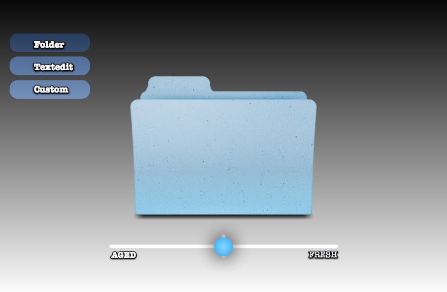
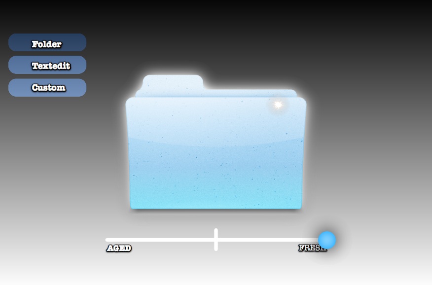
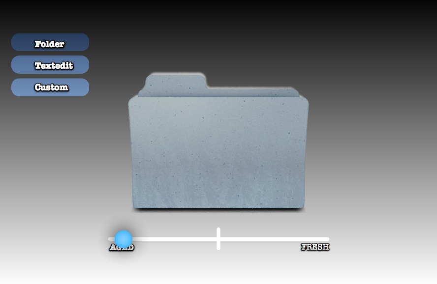
I've previously written about the idea of visually ageing files and folders. The aim is to provide more metadata to the user visually—which of these folders did I just put here? What's been here a long time and really needs to be filed?

In the spirit of Getting Real I've made a quick mockup app called 'Freshness' to demonstrate how these 'ageing' and 'freshness' affects might be programatically applied to any icon.

You can download the Freshness app for free and have a play. I'd love to hear your feedback. Please note that Freshness.app requires Mac OS 10.6 Snow Leopard.

Are the effects too strong, or too subtle? Does this provide real value, or is it just novelty? How else can 'age' and 'freshness' be visually displayed? 


Credit: Original Folder Icon by Guifa. 'Custom' Application icon by Sebastiaan De With. Made with Quartz Composer and turned into an Application with Kineme's QuartzBuilder.

Wednesday
May202009

Beausage

Michael Honey kindly pointed me to a new term: Beausage.

…a synthetic combination of the words beauty andusage, and describes the beauty that comes with using something. Metacool

This term describes what I've tried to imagine in the look of a loved folder. That there is useful information in the wear on objects by thousands of human hands doing the same thing. And that this information can actually be beautiful, and even aesthetically attractive in it's own right. For example, these 'desire lions' with hand-wear-polished noses, named from the existing term of 'desire paths' created by thousands of interactions. Image from Portigal.com

What's interesting to me is the value that 'goat tracks' and 'worn edges' have in the real world. They show us that there are popular paths, and show us the way to the the most popular objects and destinations. It's actually very 'web 2.0', leveraging the social web of human decisions. Of course, you don't *have* to follow the path, but knowing that many other already have is a strong cognitive influence. Also, the paths that people take are not always the ones laid out for them by designers, and can indicate better designs to the people in charge. You could imagine paths being worn into your desktop, showing where you've travelled a lot before, or paths worn into websites, showing the most popular sections, and paths to other sites. There is even more richness possible than in the real world, because in a computer simulation of wear'n'tear we can capture more data: the age of the decision, the time it took to make the decision, the time of day, how that person relates to us socially… the list goes on.

This image of a map of Florence, borrowed from Design with Intent, shows a real-world abstraction of travel to 2D. This map has a worn away 'You Are Here' section, with paths leading outwards. Why not on the web and desktop? You might argue against the idea, saying the web/desktop is too dynamic, that destinations move too often, or that interfaces evolve faster than desire paths could form. Either way, I'd love to find examples proving or disproving this idea.


Click to read more ...

Sunday
Mar082009

Time as Interface Element

Time. Software is increasingly focussed on helping us understand and manage it. For a great example, see the unreleased Palm Pre; it's diary view shows spare time in a beautifully simple 'crumpled' concertina UI. So, how do other UIs handle time?

Temporal Interfaces
Lukas Mathis' blog, ignore the code, recently covered some mockups of current, and possible temporal interfaces. Including one from this blog :-) One of the examples showed how the file 'list view' could better serve temporal thinking.

My Take
Lukas' approach inspired some thoughts of my own on the problem of representing time visully. I've put Lukas' original example topmost with my iterations below; if an item is separated in time from the other items — and since we seem to think about time in a spatial way, how could we show this spatially? (click for fullsize)

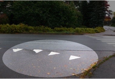
I like the 3rd, 'peaks' iteration as it reminds me of something I saw in Norway — a 'Give Way' line evoking a steep slope, big bear teeth, or sharp spikes. "Slow Down!" It seems a nice visual metaphor for time.

How else could time be shown spatially in this context?

Another conversation for another day: missing UI metaphors for working with (as opposed to simply understanding) elements which travel through time. We can tell it's a problem because people are going to the effort of devising complex workarounds. For example, the 37signals crowd has a nifty solution for throwing emails forward in time.


Click to read more ...

Tuesday
Aug052008

Does Mess really Exist?

Leaves on a forrest floor A recent post on the excellent blog Functioning Form, titled Beneficial Disorder in Interface Designs — makes reference to a book called A Perfect Mess. A Perfect Mess - A book The blog post concludes with the following statement;

We often strive for buttoned-up organization in our application and system designs -perhaps at the cost of being able to maximize efficiency by tolerating some disorder in our designs.
But, what is disorder? I propose that there is very little true randomness in our visible natural world. There are some systems which produce almost unpredicable behaviour, like the weather, but much of the variations and complexity has fairly obvious causes and relationships. Some trees are shorter than others, because they lie in less nutritious environments or are eaten by animals more. The river trickles one day and flows the next, due to the rain upstream a few days ago. Even in the placement of the leaves that fall on the ground; some fall further due to their shape, and there are various layers of aged leaves depending on the wind conditions of each and every day. Some will be disturbed where an animal had dragged its tail through, and so forth. Bushmen of many cultures could, and can, track animals days away, by noticing the subtlest evidence left in the forrest or bush. So, instead of seeing a mess, humans are good at seeing a 'complex system with lots of clues'. I think the problem of 'mess' is probably accentuated due to:
    1. We've never had so much stuff to keep track of in human history. Thousands of individual personal items. I can't imagine hunter-gatherers lugging more than a dozen items around with them 2. We can memorize many 'things' or landmarks in nature, but they are linked in a unchanging map. Seeing the gnarly tree-that-looks-like-a-man meant that the ocean was nearby 3. Many things in nature are readily disposable and replaceable. Lose your fire-poking stick? No problem, there'll be another one around. And what's more, the one you lost will happily biodegrade back into the environment And on the computer: 4. Files, folders, events often look pixel-perfect identical, at least on the Mac. Windows actually makes some attempt to show what files are in the folders. But there is no evidence that they've come and gone, that they are old or new, oft-used or brand-spankin' new.
Example:
Folders
Uploaded with plasq's Skitch!
Here are two folders. One is brand new, and empty, untouched. One is old, used often and stuffed full of files. Which is which? In the race to a perfectly organized environment, we've lost the clues by which we are habitually and genetically designed to find and understand. That quote again:
...maximize efficiency by tolerating some disorder in our designs...
I propose that we should not tolerate disorder. Because it's not disorder. It's simply a lot of information which is not represented well. And some things do seem to age beautifully.. the characterisitics which have been ironed out in computer User Interfaces don't have to look ugly. Ancient Chinese greened metal pot What computer systems exist or have existed to show this kind of data?

Click to read more ...