UI&us is about User Interface Design, User Experience design and the cognitive psychology behind design in general. It's written by Keith Lang, co-founder of Skitch; now a part of Evernote.  His views and opinions are his own and do not represent in any way the views or opinions of any company. 

Navigation
Categories
External Articles

Entries in animation (7)

Wednesday
Jun022010

Jigsaw Junior — an iPad App for Kids

I wanted to share with you a little side project I've recently completed with a good friend. Jigsaw Junior for iPad (iTunes link) is a kid's jigsaw puzzle app we've just released — read more at the official Jigsaw Junior site here.


Definitely got a 'laundry list' of things to improve, so I'd love to hear your feedback to fill in the gaps.


Thursday
Oct012009

MacDevs, meet GameDevs

I'm no hardcore gamer. I own a Wii and PS3, but they mostly gather dust. I've enjoyed some time playing Spider and Field Runners on the iPhone, but that's the limit of my attention. And occasionally I dust off Age of Empires on the Mac. Oh, and I strangely enjoyed playing Ramp Champ on the iPhone. What an odd game, there couldn't be anything simpler* to play the game at some level, just flick your finger up the screen. To play well, of course, is another matter.

So I'm as casual gamer as anybody. But I am desperately interested in gaming, and game development—game development is about building fun, engaging experiences, using motion, art, sound and flow. That's what we application creators want to do too, right?

Mac developers have always prided themselves on great looking graphics. And now we enter an age where that UI includes the subtle and practical use of animation and real-time graphical effects. Game devs have been working on making artistic, believable, fast and fluid OpenGL-optimized stuff for years, yet I've personally seen very little cultural crossover to date. I would love to see more cross-polinization from the game development community and Mac App development.

Tools-wise, I've been looking into Unity, a game-creation engine and development environment that seems to have become the winner in the space for creating physics-driven games. It seems like it could be a useful tool for mocking up and testing interfaces.

Now, of course, the 'game' experience and the App experience can be totally different things. Gaming can be all-encompassing, Apps simply a piece in a puzzle. Learning the interface of a game can be a fun experience, having to work out the interface of an App, an infuriating one. The same bright, loud and novel interface in a game might be completely tiring in an App, which instead aims to focus your attention on your content. Although, there are many hours spent in WoW (etc.) where I suspect any novel/distracting interface elements create the same annoyances as in an App.

I welcome the game developers** who are sniffing around after the iPhone App Store explosion. Come, share your wisdom.

*Ok, there is an interaction which could be simpler: a single button. And I'm proud to say I know a guy who's build an awesome game (Fishie Fishie) using just that.

** Oh and I should add that there's some great Mac Game dev houses, bust 'serious' gaming is still very much on the PC, afaict

Click to read more ...

Friday
Sep252009

Iteration 2 on Dock Mockup idea

Based on your feedback, here is an iteration on my previous design post to better show what applications can accept certain files dragged to them in the Mac OS X Dock.


Click to read more ...

Monday
Jun012009

Pixar Discuss Character Design

The New York Times has a slideshow of some character designs from the Pixar movie "Up", with narration by the director and production designer. These guys are technicians of characters.


Click to read more ...

Monday
Feb022009

Projecting Coolness

  NOSTE installation from Teemu Määttänen on Vimeo. A growing popular trend in art visuals I like is the combination of real-world shapes and computer generated animation. Artists create a physical white 3D surface, map it in software, and use something like Processing and a digital projector to accurately map animation back on to the real-world objects. All examples here are by Teemu. Here is the same installation with a moving camera: Noste installation, moving camera from Teemu Määttänen on Vimeo. Click the image below (no embedded video available) to see my favourite installation video by Teemu Määttänen. Warning: Loud music. demosession (via CDM)   Maybe the future will look as cool as it does in the movies.

Click to read more ...

Monday
Feb022009

Interfaces and Animation 

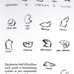
Motion can supplement the communication of computers, to good and bad effect. In recent years, simple animation in computer interfaces is becoming less and less costly as GPU power is rockets skyward and new animation APIs require less coder-time to implement. It is therefore a wonderful time to consider utilizing animation as an additional channel for communication. But can simple shapes and icons get across consistent messages through animation? Apparently so. The Orphan Film Symposium examines the work of psychology professors Fritz Heider and Marianne Simmel. In 1944 they created a short film illustrating the emotive potential of basic shapes. The film was shown to test subjects. The research assessed the ability for motion alone to portray emotion or a story in a consistent way — it turned out that motion alone could impart emotion. Subjects reported emotions in the story relating to bullying and other conflict. This is possibly due to the desire to see a human element in many non-human forms, called anthropomorphism Disney's research has also proved to be a gold mine for me; the Disney animation studio spent years mastering the art of making inanimate objects expressive. The following example is taken from the enthralling The Illusion of Life by Frank Thomans and Ollie Johnston.  Used without permission. Will take down on request. Used without permission. Will take down on request. Disney also researched and developed, over many years, fundamental techniques to make animated emotion "feel" right. You can read a basic description of these techniques that John Lasseter in a handout presented to SIGGRAPH titled Principles of Traditional Animation Applied to 3D Computer Animation. These techniques are:

  • Squash and Stretch
  • Timing and Motion
  • Anticipation
  • Staging
  • Follow Through and Overlapping Action
  • Straight Ahead Action and Pose-to-Pose Action
  • Slow In and Out
  • Arcs
  • Exaggeration
  • Secondary Action
  • Appeal
These techniques make each motion more cognitively clear, by accenting either the visual or cognitive distortions of shape and path. For example, here is a particularly clear example of Squash and Stretch bouncing ball animation. There is a wealth of knowledge in the animation industry that could be applied to new interfaces. Of course, there are downsides to motion. Nobody wants an all-dancing, all-prancing interface, with icons zooming around, squishing and spinning excessively. And the use of motion in computer interfaces is exploratory, with limited commonly used gestures — the occasional bouncing icon, flipping settings panel and 'genie' effect, ex. So what might better use of motion look like? What are some 'universal' gestures people would recognize? Have a look at the 10 motions of this experimental interface:   Abstract Social Interface from Keith Lang on Vimeo. Video supplied by Bilge Mutlu. Used with Permission.  The video above is by Bilge Mutlu and his team at the Human-Computer Interaction Institute at Carnegie Mellon. His accompanying research paper  "The Use of Abstraction and Motion  in the Design of Social Interfaces"  explores the emotions and interpretations of an abstract animated interface. Bilge has been kind enough to include video which accompanies this paper. When I look at this video, I can imagine the motions expressing:
  1. The system is waiting for some input or data tranmission
  2. The system is processing information
  3. The system is sleeping
  4. 'Spanner in the works'?
  5. There is something outstanding which requires your attention
  6. I don't know
  7. Configuring…
  8. Finishing configuring
  9. Testing
  10. Hard work
What are your interpretations of the video? You can read the emotions that other people, with considerable consistency, associated with the movement in Bilge's  paper.   Bilge emailed me to add an additional point:
…[just] as Disney developed these principles for creating lifelike motion for their characters, there are techniques for designing abstract motions that are not (necessarily) lifelike, but expressive of emotions and causality. I used "mood boards" to identify shapes, forms, motions that might communicate each emotion (there is an example of a mood board in the paper, which, of course, you can use). Heider and Simmel used abstraction of actual human behavior (you can almost replace the shapes with people). And, I am sure there are other techniques that others have developed. 
So motion can convey meaning, whether it be anthropomorphic (human-like) or not.  Could subtle animation ever be a part of most interfaces? How much motion is too much? Are the current animations good or bad?

Click to read more ...

Tuesday
Jul152008

The Common Melodies in Mother's Voices

My friend Jessica Enders pointed me to a great story on New York Public Radio's RadioLab. Look for an interview coming soon with Jessica of formulate.com.au Look for the http://www.wnyc.org/shows/radiolab/episodes/2006/04/21">'Sound as Touch' story.

Radiolab
Uploaded with plasq's Skitch!
The interesting result is that there are four 'melodies' that seem common to the voices used by parents to their children across all cultures. What if more applications used these kinds of sounds to communicate messages? For example, Instant Messages always use identical sounds -- what if an "ok" had a certain sound, or a question had a related, but slightly different sound. Logically,  a "bye" or similar phrase in the chat would invoke yet another, different sound. The benefit of these sounds is to enable you to choose how soon to respond to a message, without needing to view it. Instant Messaging, by it's very nature, encourages multitasking.. and if you're busy with another task it may be some seconds or minutes before you switch over to the message. If you knew that message was simply an "OK" then you may not switch so fast.. but if it was a "bye!"  then you may switch over quickly to be able to say goodbye in return before the other person logged off. There are some attempted solutions out there for this problem. One of the more successful is Growl, which shows small text messages on the side of your screen, no matter what app you're in.    The problem here is that this notification is using the same mode as you're probably already engaged in: reading text. So If you're typing away at your document, and an Instant Message comes in, then you need to switch your visual focus to this new area, and read the text. There is no other way to absorb this content.  Better would be to map these message's context and content to some kind of animation. An excellent example is the way the icons in the Mac OS X Dock jump up and down to attract attention when an application requires user input.    The human brain is optimized for certain tasks, and can handle different types of information at once, as long as it's not in the same modes/channels of communication.

Click to read more ...