
Ageing Icons with Freshness App
I've previously written about the idea of visually ageing files and folders. The aim is to provide more metadata to the user visually—which of these folders did I just put here? What's been here a long time and really needs to be filed?
In the spirit of Getting Real I've made a quick mockup app called 'Freshness' to demonstrate how these 'ageing' and 'freshness' affects might be programatically applied to any icon.
You can download the Freshness app for free and have a play. I'd love to hear your feedback. Please note that Freshness.app requires Mac OS 10.6 Snow Leopard.
Are the effects too strong, or too subtle? Does this provide real value, or is it just novelty? How else can 'age' and 'freshness' be visually displayed?
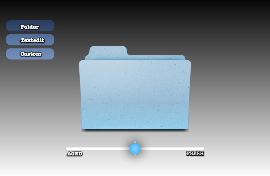
Credit: Original Folder Icon by Guifa. 'Custom' Application icon by Sebastiaan De With. Made with Quartz Composer and turned into an Application with Kineme's QuartzBuilder.
 Keith Lang
Reader Comments (15)
I think it needs to be more striking. I'm not usually looking at icons at such a large level. I have them scaled down to 16px or 32px max. So the haloing helps more than the deterioration.
GREAT IDEA!
Andrew has a good point -- the effects would have to be carefully optimized for all icon sizes to be useful.
For those of us with Windows and unable to try it out, it would be nice to see the effect in context, i.e. what does it look like to have folders of several different ages side by side? Is it easy to tell the difference between old and new, and the relative age of two folders, or is it hard to distinguish more than two or three different "stages of life" of folders, when looking at them en masse?
I downloaded the Freshness app and played with it. I think that the changes are too subtle.
I like the idea of showing the age of folders in general. But rather than doing it in an "analog" fashion, how about doing it using 2 or 3 visuals (or stages) only? If the folder is brand new and never used, it would show the yellow sparkle. If it hasn't been opened in over, say, 6 months, it will turn darker or have an aging effect to it. This would be a simpler first step.
I pretty much agree with these sentiments. I think it's a good idea in general to show age (or rather, age since last time updated). I also feel like they need to be less subtle, more apparent at smaller resolutions, and you probably only need 3-4 states.
Thanks all — I appreciate the feedback…
- More obvious changes, which appropriately
- Quantified steps, rather than continuos
Do you think iconographic (sparkle) VS image processing (desturation ) is better?
Yeah It definitely needs a stronger change. I would have the shape of the folder change with age as well - this would also help with smaller icons as it would be more visually different.
If the folder also showed had many files it had in with a bulge or files coming out the top - ragged edges and such on those would be great to show age.
Here's an icon I made a while back to house some older projects. I think it was even inspired by your first post. Perhaps you'd like to take some inspiration from it.
http://img171.imageshack.us/img171/1358/screenshot20100322at122.png
@Ryan
Whoah, that's *nasty* looking. :-)
Just found this again while clearing out NNW tabs.
How does this work ? Does it apply a general ageing effect to any icon, or does it allow icon designers to design aged icons too ?
I think control needs to be given to the icon designers. Looking at the document icon in the sample app, I can see how making the paper turn brown and the ink fade might be a nice way to indicate age, rather than just applying a filter to make it a bit fuzzy.
It's a nice idea, BTW.
Thanks.
The effect is a general image processing that is applied to *any* image.
And yes — I agree — allowing designers to control this is optimum, but they won't all be bothered to it. It would be equivalent to the different size icons in an .icns file — but for time, instead of dimension.
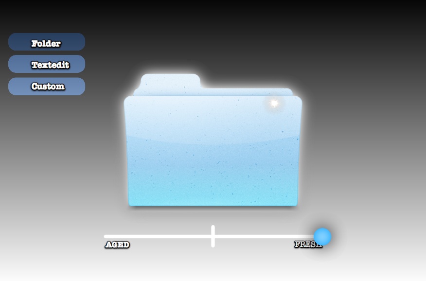
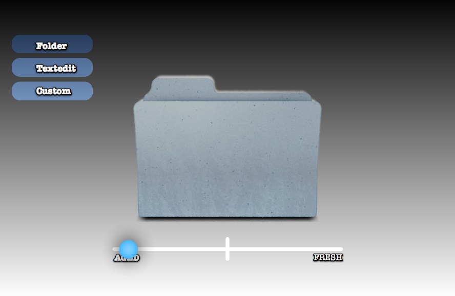
The app itself applies quite a few processes:
For old:
Some desaturation
Some 'sepia' effect
Some rippling distortion
Some 'dirt' overlay
Some 'faded overlay
'Dust' rendered on top
For new
A glow
A 'bling' specular point highlight (star)
Increased brightness
Increased saturation (applied to lower half)
Addition of rendered 'sheen' a la iPhone
In theory, icon designers could actually be submitting quartz composition files for icons, which would allow them to control how they age, etc.
Just saw this and thought I'd pass it on as related to the freshness idea:
http://bit.ly/bMXQrp
Hi Josh — that's an awesome find. The conjecture is that the increasing sepia is a bug, but it works well as a UI aspect, regardless.
Perhaps think about shininess? When you buy a new device, it's generally shiny, then after scratches and fingerprints it has less "luster"
also perhaps just a more realistic folder, manila folders usually get bent or wrinkled after a while
Hi Ryan
Thanks for the feedback. You might note the 'shine' and specular sparkle thats on the 'new' folder.
The problem with 'bending the corner etc, is that it requires a 3D model. Or some unreliable 'faking' it…I'll look into it though!
Maybe more striking color variations since those are pretty obvious. Great stuff.