
Can't Read URLs Some People
This post is a reply to "Some People Can't Read URLs' by Jono of Mozilla.
The backstory is as follows: ReadWriteWeb had published a piece about Facebook. Through the magic of PageRank, this page became the top Google listing when you searched for "facebook login". Here's the unexpected bit: comments started pouring in declaring this new Facebook redesign to be terrible from people who thought the ReadWriteWeb page WAS Facebook. Some viewers of this saga took this to be a display of the utter stupidy of the majority of Facebook users. Others interpreted it as a demonstration that technology was poorly designed. To my understanding, Jono's piece breaks the problem down into a dichotomy between a simple web for simple users, VS a web with educated users. The solution he proposes would involve educating users about URLs, to result in the latter. I don't quite agree.
I like education. It's a wonderful, empowering, liberating thing. I also like stories. Let's start with one of them.
Twinsong
The year was 700AD. The Angles and the Saxons had been living in Britain for a while, having migrated over from Germany. Apparently everyone forgets about the Jutes. They were there too. But we'll forget about them. Anyway, this bunch spoke their own language: Anglo-Saxon. Though it laid the foundations for modern English, some fundamentals differed;
[From a truly excellent course guide on the history of Anglo-Saxon by Professor Michael D.C. Drout. I highly recommend listening to the Audible version for it's out-loud Anglo Saxon]
In Anglo-Saxon, you could say “dog cat ate,” “ate cat dog,” or “dog ate cat” and still not tell your reader who did the eating and who got eaten. Instead of relying on word order, you would put a tag on who got eaten, so “dog ate cat-ne” and “cat-ne dog ate” and “cat-ne ate dog” would all mean the same thing and would be different from “dog-ne ate cat” or “cat dog-ne ate” (whoever gets the –ne is the one who gets eaten).
Got it? OK. A hundred years later, the Vikings invaded, and stayed. Things got confusing for a while with the Danish and Norwegian native languages intermingling with Anglo-Saxon. Later the French rocked up. Bah. What a mess. Jump in your DeLorean, punch in 2010, and —sssSPOW!— we find that English now uses word order, not tags, to define whom ate who. Dog ate cat. Not cat-ne ate dog. Point being that unless you know the rules, it can be very confusing.
Let's continue the story here in the modern era. I remember Tech journalist Leo Laporte* telling the following story…
Leo wanted to share with his wife his newly created streaming tech-news site. I'm sure he must have been bursting with pride of his accomplishments of duplicating the functionality of a multi-million dollar broadcast station in a single room in his cottage. He instructed his wife to visit live.twit.tv to enjoy the fruits of his labour. But, she accidentally typed into her browser something not quite right — twit.live.tv. After seeing the result she demanded an explanation. I can tell you the site she found is Not Safe For Work and doesn't contain in-depth comparisons of iPad vs the Kindle book reader.
Same problem, different millennium.
The URL bar seems to me to be the last bastion of CLI that the average joe is forced to deal with. All these slashes and dots. Get one letter or dash wrong, order some words around and it all goes to hell. So, users give up and just type into Google.
So what the heck does the URL actually do, from a UX perspective?
- Lets you go to a particular place on the web by typing something in
- Tells you where you are, for example if you've been clicking links and find yourself on a new page, or site
- Provides a secure 'where am I' information. If you're browsing in the Western World, facebook.com usually means you're at facebook.com
Now I don't know much about networking. I haven't been following browser/ HTML5/DNS debates. BUT what I do know is that URLs are a weak point in the user experience. In the words of MC Hammer, breakitdown…
- Lets you go to a particular place on the web by typing something in
Bit of a fail here, as we've already discovered above. One of the problems is that the semantics are not understood by average punters.
How about we have the browser help?
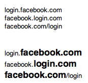
The important stuff is big and bold. Much more could be done. Props go to the Mozilla team for the Awesome bar, which is forging ahead in usability.
2. Tells you where you are, for example if you've been clicking links and find yourself on a new page, or site
Fail, because people aren't watching/noticing. I really like the little icons that appear next to the URLs — favicons. I'd love a bigger version. How about we colour the chrome of the browser with it? Facebook uses 'you're leaving Facebook.com' dialogue boxes to let people know they're going out in the Wild West. Effective, but clunky.
3. Provides a secure 'where am I' information
Smells like a Pareto Paradigm to me:
- Many people, not just a few (hence the newsworthiness of the story) are accidentally visiting the wrong site
- There's very few popular browsers that many use: Firefox, Chrome, Safari, IE, Opera.
- Of all the web's sites, there's a few that many non-savvy surfers use: Facebook, Myspace, Hotmail, GMail, Yahoo, Ebay, Amazon
It follows that the big browsers could have a whitelist for sites they know non-savvy users would be visiting and show some warning for sites that look like they're trying to pretend.
As for Verified sites: Firefox is doing the best job of the browsers I use, showing that a site is verified. FF displays a large green button for 'verified'. But that only means something if you're expecting it to appear. Classic UX design problem: If you don't know, (or forgot) that it's supposed to be there, you won't notice when it's not.
How about a standard symbol that would appear in a browser that a page could reference "you should be seeing this symbol"? Or some better specification for integration between the browser and the secure site itself.
You May Argue
"It's not that complex to learn how a URL works!"
Ever seen someone double-click on a link to 'open' it? They learnt to double-click on desktop icons in order to open them, and are now applying that rule to the web. And here's the problem: there's a lot of arbitrary technicalities in computing that the users are being asked to learn about. I'm all for the education that Jono suggests. But general, reusable knowledge. Not the inner gears and ratchets of a mechanism conceptually born two decades ago that we call the World Wide Web.
"If we hide the guts of the internet away from the average user, won't they become docile clueless consumers?" "One day they'll find themselves locked into some DRM encrypted, Apple/Microsoft/Google-only internet."
I like the way Google Reader handles this. The average user may not know anything about RSS, or where to find the appropriate RSS link. Instead, they just plonk the site into Google Reader and it works out the appropriate RSS URL for itself. The RSS standard is not compromised.
"If the user isn't savvy enough to see the huge ReadWriteWeb banner, how are they to notice anything more subtle? AKA "what hope is there for these losers?"
The perceived complexity of the URL bar is a self-fufilling prophecy to failure. People don't understand it, so they don't use it, so they don't notice when it displays something different to what they should expect.
* Interestingly, http://www.leolaporte.com/ is hijacked. If the 'president of the internet' doesn't have a URL, what faith can we have in URLs at all?
** Bonus points to anyone who gets the Twinsong reference to the stories
 Keith Lang