UPDATE:
My rounded rectangles cognitive
argument is getting a good thrashing — which is a good thing. I'm as keen as anyone to find out if the theory holds water, and if you can direct me to better research, I'd love to read it. Please share!
May, 1981
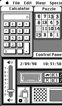
According to folklore, in the early development of the Apple Macintosh, resident graphics genius Bill Atkinson performed a miracle. He found a way to overcome the Mac's 6800 chip's math limitations thus enabling the OS to draw circles and ellipses (not just rectangles) on the screen at a blistering speed. He proudly showed this new ability off to the team. But this was not enough for the leader of the Mac team, Steve Jobs. No, the father of the Macintosh asked for one more thing.
That thing was
rounded rectangles. Rectangles with rounded corners. Rectangles with the sharp bits beveled off.
Friendly rectangles. Steve wanted the Mac to speedily draw ellipses, squared rectangles AND rounded rectangles. But Bill was certain this shape would be extremely difficult to draw at speed. And not even a necessary part of the Mac's drawing library. Jobs disagreed;
"Rectangles with rounded corners are everywhere!" — Steve Jobs
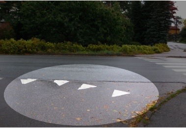
Steve took Bill on a walk, pointing out the ubiquity of rounded rectangles in the world around them. Eventually a rounded rectangular No Parking sign convinced Bill.
The very next day, Bill proudly returned triumphant. Overnight he'd written code to draw rounded rectangles at turbo speeds. And once rounded rectangles were as computationally cheap to draw as square-edges rectangles, they became ubiquitous on the Mac. "RoundRects" became buttons, sliders and regions in each window. They helped define the 'safe' interface of the Macintosh. And in the early days, those round beguiling corners spruiked the Mac's softer approach, luring customers away from IBM and Microsoft. And to be clear, I'm
not saying that Apple were the
first to use the rounded rectangle in interfaces — but they used it like no other company of the time. Today, the concept of 'round = touchable' survives and is formalized in
Apple's HIG:
Visual cues, such as the arrow on a pop-up menu, help people recognize familiar elements. People learn to associate certain behaviors with specific elements based on their appearance. For example, people recognize push buttons by their rounded shape… — OSX Human Interface Guidelines
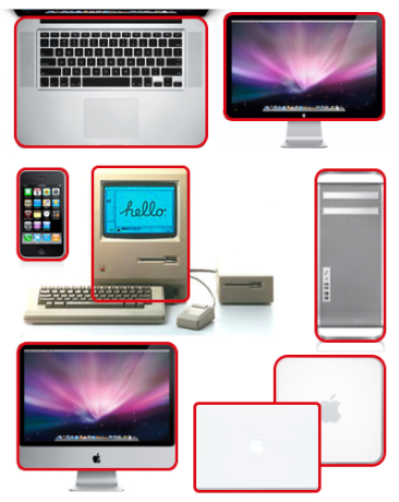
 Rounded rectangles didn't stop with software. Increasingly, the rounded rectangle has become the parti of Apple hardware design. The shape made large machines approachable and small ones pocketable. But why is it so visually appealing? Sure, there is a certain synesthesia to a shape which has no 'sharp' edges to poke yourself on, even if it's just rendered out of pixels on a screen. But what of the aesthetic? Rounded rectangles simple seem 'easier on the eye' than the square-edged variety. Why?
Time for an expert:
I asked Professor Jürg Nänni, author of the exemplary
Visual Perception, a book detailing our best-to-date scientific understanding of the processes involved in visual cognition. "Could rounded rectangles actually take less effort to see?"
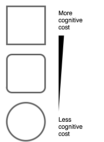
Nänni confirmed my theory: "You are absolutely right. A rectangle with sharp edges takes indeed a little bit more cognitive visible effort than for example an ellipse of the same size. Our "fovea-eye" is even faster in recording a circle. Edges involve additional neuronal image tools. The process is therefore slowed down."
 Professor Nänni is saying that rounded rectangles are literally easier on the eye. Put another way, compared to square-edged rectangles, rounded rectangles are more computationally efficient for the human brain. To me, this is a revelation. An idea that at the very least demands more investigation.
If I'm an interaction or experience designer, the machine I am optimizing for is the human. I want a design that takes the least CPU cycles for the same output. And from my current perspective, rounded rectangles provide an example of optimizing a design to reduce human visual system's CPU cost. There's only so much visual attention to spend.
What is the visual cognitive cost of…
- …a garish color scheme VS a beautiful one?
- …instantaneous disconnected movement VS smoothly animated motion?
- …one font as compared to another, in a particular context?
[UPDATE: I've switched the order of the 'animated' bullet point to save confusion]
So!
The rounded rectangle is seemingly just the tip of the iceberg in linking cognition to aesthetics, but I'm not sure how to move forward. I don't expect UI and UX designers to have their skills replaced overnight by some magic formulae. I
do expect that examples like the rounded rectangle will strengthen the argument to 'go the extra mile' to make interfaces which are aesthetically pleasing. Now I want to know what other examples there might be which show that certain aesthetic elements are, in fact, simply optimizations for the human visual system.
Click to read more ...
 Monday, September 14, 2009 at 9:49AM
  I think Clippy, the Microsoft
  Keith Lang |
  1 Comment |
  cognitive science,
  psychology,
  smart computers in
  Video
Video 