
Time as Interface Element
 Time. Software is increasingly focussed on helping us understand and manage it. For a great example, see the unreleased Palm Pre; it's diary view shows spare time in a beautifully simple 'crumpled' concertina UI. So, how do other UIs handle time?
Temporal Interfaces
Lukas Mathis' blog, ignore the code, recently covered some mockups of current, and possible temporal interfaces. Including one from this blog :-) One of the examples showed how the file 'list view' could better serve temporal thinking.
My Take
Lukas' approach inspired some thoughts of my own on the problem of representing time visully. I've put Lukas' original example topmost with my iterations below; if an item is separated in time from the other items — and since we seem to think about time in a spatial way, how could we show this spatially? (click for fullsize)

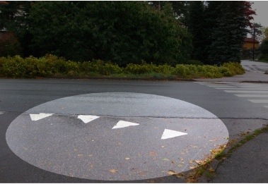 I like the 3rd, 'peaks' iteration as it reminds me of something I saw in Norway — a 'Give Way' line evoking a steep slope, big bear teeth, or sharp spikes. "Slow Down!" It seems a nice visual metaphor for time.
How else could time be shown spatially in this context?
Another conversation for another day: missing UI metaphors for working with (as opposed to simply understanding) elements which travel through time. We can tell it's a problem because people are going to the effort of devising complex workarounds. For example, the 37signals crowd has a nifty solution for throwing emails forward in time.
 Keith Lang
Reader Comments (10)
I think it could be interesting to have a visual interpretation of time in cover flow. In Safari 4 cover flow is used for searching your history but you can't really see when you last visited that page.
Hmm interesting. I imagine if coverflow wasn't spaced evenly it would look rather 'lumpy'…
I agree, but still, I think coverflow has more potential for adding visual clues. Aging clues could be added much more subtle because the pictures are really big and don't look perfectly clean and identical by nature.
Time Machine? :)
True Scott, Apple has made a good use of the Z-axis for time machine — and that seems to be how we think about time. But I was thinking something different.
Interesting article. I could see apple use this concept in coverflow. Nog by seperating the items in coverflow itself, but by seperating the scrollbar below as a timeline. Somewhat like they've done with long lists on the iPhone. I can imagine that this is what it will look like:
http://img3.imageshack.us/img3/3413/cfl1.jpg
You get a separation by date so if you scroll you get an idea of where in time you are. If you then want to get a more specific view of that period you click on it's label and you get the following:
http://img13.imageshack.us/img13/9494/cfl2w.jpg
That's essentially a spotlight search, but visually more clear like they've done in iTunes. This ofcourse could also be implemented for viewing files/folders by type or by... anything really...
Thanks Stef
A great idea — and I think we'll be seeing more of this 'information in the scrollbar' approach in the future. It's a point of a lot of interaction, but is not very dynamic at all…it could be letting us have much higher level control, jumping to starting with 'Q', or as you mocked up files of 'today'.
Interesting to note that your mockup has time aging the more it goes right, but in Safari 4 which uses coverflow for time, they've made it go the other way.
Note that OS X's 'smart folder' feature already allow you to organise things by age. By default, in fact, the Finder shows you folders for 'Today', 'Yesterday' and 'Past Week' in its sidebar, but you can create your own.
Yeah... I'm comming a bit too late for the Party, but I'd like to point out, that there ist a great example of time-visualization: OS X's Time Machine. A little too shiny, perhaps, but it really gives a sens of temporal depth. Just for consideration in regard to temporal interfaces.
Cheers!
The One Laptop Per Child "Sugar" interface also uses a Journal interface.