
The Look of a Loved Folder
Some 6 months ago I asked the brilliant graphic artist Wolfgang Bartelme to help me out with a visual experiment. I had a visual idea that required subtley and an eye for detail, and if anyone could make it work, Wolfgang could. Before I explain the experiment, let me give you some of the thinking behind it.
Too Clean?
Computer interfaces usually present icons identically, which themselves are often gleeming like a freshly polished Porche showflow. The icons and graphics are so 'clean', so devoid of detail, that I wondered if us human-types were possibly missing out on subtle channel of information. We know which books at the library are read a lot — they've got dog-eared pages. We can tell the new books from the old, the frequently used, to the dusty unused. I wrote an earlier post on the topic of 'mess'. And of course, the idea of making a computer space more 'realistic' is not a new idea. But it certainly wasn't an idea that had caught on. Why?

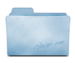
For example, no matter how new or worn, recently used or untouched, full or empty (on the Mac, at least), file folders look identical. I often search for my newly created folder amongst archaic, yet identical-looking icons.
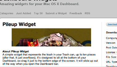
Many times a new Mac user has wondered why their disk is full. I need to explain that they have to empty the trash. They look surprised — there is no graphical difference between a little trash and a lot. For this reason I like the idea of the Pileup Dashboard Widget which piles up ugly looking junk as your trash fills up.
 Of course you may say "I use a computer to avoid ugliness like dirt and grime!" So the question is,:
how beautiful and stylized could the characteristics of newness, age and usage visually look?
The perfect job for Wolfgang — if you're a Mac or iPhone user you've possibly come across his beautiful work. I asked him to illustrate:
- What if a folder or application was new?
- What if it was old, or really old?
- What if it lay untouched for some time?
- What if the object was taken away, what would remain?
The Results:

As you can see, Wolfgang iterated on standard Mac folders and an application icon to convey the different facets of each object. There will be many fans of Wolfgangs work who will enjoy the set of design iterations on this Skitch thread.
Some of the many arguments against adding more realism in this way:
- 'Why not use a different file view, like a list sorted by age?' This is true, as computers can do the filtering for us. And as you search, and learn more about the information space, you can formalise and add more filters as you go. For example "I remember it was in this folder…(click)…hmmm lots in here…I remember I used it last week…(click)… and the folder only had a few things in it…(click)…ah there it is." This is called facetted search.
- Perhaps it's not possible to make this many variables look 'pretty'. After all, the original Macintosh trash can had flies — which were removed for aesthetics before release, and there is a history of making clean, shiny, interfaces…perhaps with good reason.
- I contacted the eminent Cognitive Scientist Steven Pinker and asked him about this topic. He explained that while we're good at seeing single changing variables in a lineup (the reddest apple in the bunch), our ability to search declines when we search for a 'conjuntion' — the overlap of many variables like age, usage, size, etc. Perhaps this means a visually richer system would be cognitively expensive: no net gain
Was the experiment a success? Could this approach add real value, or just noise?
 Keith Lang
Reader Comments (20)
Maybe a file count/size badge for the Trash would be helpful.
@ Vincent I might have to disagree with you this time on a number of points :-)
I'm not sure a sparkline is the right tool for the job here because the aim is to allow for quick comparisons across many elements. A sparkline seems more useful for showing relative changes, and important points in time.
"some people got in the habit of immediately emptying the trash to relive the pain — which meant a lot more lost files."
IMO the problem currently lies at the other end of the scale because people are not aware of having STACKS of files in their trash, as opposed to just some. I agree, we don't want people emptying the trash all the time. That negates the function of the trash can. What we do want, is people maintaining a reasonable amount of Trash, a nice buffer against mistakes. Which the current interface doesn't help with. And @Scott I'd say is the same problem that some arbitrary numbers would have. How do you know how much is 'too much'? 1230 files? 4291 files? 0.5GB? 7GB?
Really, one would look at what we're actually trying to convey — when is there too much trash. Probably a simple algorithm could work that out, based on disk size, etc. And in fact, we're probably trying to cure the sympton rather than the disease — there's no reason to have to throw out trash all in one go. A smarter trash can (you can probably make your own with Mac software Hazel, or some Unix scripts) might simply delete month old, untouched files, regulated also by system space needs.
With the risk of angering Pro-Tufte crowds with beautifully drawn pitchforks, I will say I think Tufte's work is very much rooted in print, in trying to fit more information into a static 2D space. I also believe, because of the lack of popular update, that there are aspects still to be solved in infographics.
For example, the human eye pre-cognitive system is optimized for vertical and horizontal lines. Which I think explains why the systems presenting information as multi-connected tree hierarchies never seems to catch on. Would love to hear what you think.
I loved the icons, I hope that Apple and Microsoft pick up on the idea. IMO, adding a badge would be a case of too much information -- the icons provide just about the right amount of information.
I love them! Any chance we can get them as ICNS? I currently have a similar set of icons which I assign manually to folders so I can find them more easily. Those icons would look a lot better, though :)
@Hisham, thanks for the kind words.
@Alexander, no, sorry they're not available for reuse at this time. But thanks for the kind words :-) Would love to see an example of what you've done to solve the problem yourself.
I love posts like this that bend the minds of usability-headed (but not necessarily artful-eyed) folks like myself a bit. An enjoyable read, and I'm still deciding my take on it.
@Keith Lang,
I can't think of a good use of sparklines for the trash myself :-). They were just the first example of the kinds of (abstract?) things I'd like to see in interfaces. I can't help but feel we can make things more clear by presenting data as data, not as metaphors of things it isn't.
Re: making sure the trash gets taken out, but is still provides a safety net, your idea of automatically reaping old files is the best solution to the underlying problem I've heard.
It might still be necessary to indicate when the space-savings of manually emptying the trash are significant. I don't like the idea of big files being deleted faster. If someone's stuff is going to be permanently destroyed ahead-of-schedule I think they need to be the one pulling the trigger.
A good metric for "full" might be, GB in the trash ÷ total usable GB if the trash were empty. The absolute number of GB in the trash doesn't matter, as much as if emptying the trash would make a difference in what you can do (free space).
I wonder if there should be an easy way to selectively delete a file within the trash. Right now, if I want to permanently-delete one unflattering picture or large file, I have to destroy all the other stuff in my trash as well. Having a more selective purge adds a bit more safety. Maybe a good metaphor is throwing something away that's already in the trash?
I take it you've seen the paper on "Edit Wear and Read Wear"? (http://tinyurl.com/dfvplp) A really cool idea that I've been wanting to see someone make use of. Your concept here seems really similar.
But, I'm not sure how useful the aging icons would be. It's only useful once the icon is already visible, and at that point I don't think the age of the file or folder is what I'd be concentrating on -- looking at the titles is likely to be much more fruitful. It might work well in a minority of cases though, such as where a small number of files are substantially different from the surrounding ones.
Hiya Patrick,
I've not seen that before — but that's the reason for this blog :-)
I admit the folders is a bit of an edge case — but the general idea is to get more information into the the visual space.
Oh, and there was a another paper done about edit/read wear last year: http://tinyurl.com/cw3mp4. The did an implementation in MS Word and evaluated it against standard scroll bars.
Patrick, you're a wealth of knowledge.
I love this exploration...bravo. I imagine that it would be appealing to people who have a certain sensitivity to the environmental and tactile contexts of use. There are certain files I use on my computer over and over again, and I love the idea of seeing them age gracefully. Kind of like they were characters in a RPG, gaining experience points every time I open the file and save it. I don't think this kind of information is usually saved in the filesystem, but it would be an interesting experiment to run if application and usage context were stored as part of the file system (maybe a list of open inodes) to help reconstruct the "scene" in a kind of forensic reconstruction, a digital Sherlock Holmes noting wear patterns on specific patterns of bits.
Thanks Dave - a great idea to investigate how your files and applications are being used.
These aged folders are beautiful, I love the touch of character. Bartleme has done many works I've enjoyed, but I hadn't yet seen these yet. It makes me wonder about a folder not just looking aged if it has an older modified date, but if I'm opening it frequently.
And ahhh BumpTop is out of beta today; it'd lend a physical dimension to all of this... too bad there's not a Mac version yet.
Thanx Keith for exposing me to such awesomeness. :)
Thanks Torley — yes Wolfgang is quite amazing, thanks for the kind words!
Yes - definitely a need to separate 'age' from 'use' I think.
Bumptop should be fun. :)
Love the idea. It is akin to metadata: data about the data. I would hope that "age" markings are user adjustable: what might be "old" for you, might be relatively fresh for me. But I love the concept.
Cool - a friend just pointed me to this article. I'd have a similar I've been toying with for the last few months. I think the whole concept of read & wear has real value. I think adding more 'soft' data into file & folder meta-data is key.
E.g. Number of users that have accessed a folder is very useful in a group environment, and also number of times accessed in general are not tracked at all.
I'd really like to take this type of idea and really dig into it. If anyone has any suggestions on any companies that'd sponsor this research let me know! :)
@Kevin
I wonder if there is some kind of privacy issue - seeing where people have 'been' and when.
Could the idea apply to websites, particularly 'traditional' spaces like wikipedia?
Keith - good point on the privacy issue, people don't want to feel like their being watched.
I think applying it to Wikipedia could be particularly interesting. I know the BBC redesign around 2002 had different panels that would get slightly darker the more you used them. It's in their "The Glass Wall' document that's well worth reading.
I've been very interested in the click heat maps that people have been doing lately and have used them on one or two projects and they were very useful.
http://wordpress.designpraxis.at/wp-content/uploads/2007/11/clickheat_1194035828422.png
Very interesting area, I think we'll see a lot of this type of stuff in the future.
I was one of the Mac users who was obsessive about emptying their trash!
To be honest, I'd forgotten that I even had a 'trash can', I have my dock on autohide and use Quicksilver for application launching. I just emptied my trash - I had ~1,500 files!
I can't see the relevance to this conversation, but something that's popped into my mind about a University Chemistry Lab (I can't remember if it was our own or just something I've heard).
For a long time there was a single bin that was emptied every night, students were reluctant to throw anything out incase they realised they needed it again in a couple of days and so people ended up hoarding stacks of paper which made it hard to find anything in the noise.
The lab staff introduced a rotation of 7 bins, one for each day. Each night a new bin was placed in the lab and students started feeling more comfortable in throwing notes out because they knew they had a 6 day period of grace if they changed their mind. As a result the lab became a much tidier and oganised space. A great example of interface positively changing behaviour :)