Monday
Feb022009
Interfaces and Animation
 Monday, February 2, 2009 at 1:16AM
Motion can supplement the communication of computers, to good and bad effect. In recent years, simple animation in computer interfaces is becoming less and less costly as GPU power is rockets skyward and new animation APIs require less coder-time to implement. It is therefore a wonderful time to consider utilizing animation as an additional channel for communication. But can simple shapes and icons get across consistent messages through animation?
Apparently so. The Orphan Film Symposium examines the work of psychology professors Fritz Heider and Marianne Simmel. In 1944 they created a short film illustrating the emotive potential of basic shapes. The film was shown to test subjects. The research assessed the ability for motion alone to portray emotion or a story in a consistent way — it turned out that motion alone could impart emotion. Subjects reported emotions in the story relating to bullying and other conflict. This is possibly due to the desire to see a human element in many non-human forms, called anthropomorphism.
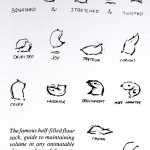
Disney's research has also proved to be a gold mine for me; the Disney animation studio spent years mastering the art of making inanimate objects expressive. The following example is taken from the enthralling The Illusion of Life by Frank Thomans and Ollie Johnston.
 Used without permission. Will take down on request.
Disney also researched and developed, over many years, fundamental techniques to make animated emotion "feel" right. You can read a basic description of these techniques that John Lasseter in a handout presented to SIGGRAPH titled Principles of Traditional Animation Applied to 3D Computer Animation. These techniques are:
These techniques make each motion more cognitively clear, by accenting either the visual or cognitive distortions of shape and path. For example, here is a particularly clear example of Squash and Stretch bouncing ball animation. There is a wealth of knowledge in the animation industry that could be applied to new interfaces.
Of course, there are downsides to motion. Nobody wants an all-dancing, all-prancing interface, with icons zooming around, squishing and spinning excessively. And the use of motion in computer interfaces is exploratory, with limited commonly used gestures — the occasional bouncing icon, flipping settings panel and 'genie' effect, ex. So what might better use of motion look like? What are some 'universal' gestures people would recognize? Have a look at the 10 motions of this experimental interface:
Abstract Social Interface from Keith Lang on Vimeo.
Video supplied by Bilge Mutlu. Used with Permission.
The video above is by Bilge Mutlu and his team at the Human-Computer Interaction Institute at Carnegie Mellon. His accompanying research paper "The Use of Abstraction and Motion in the Design of Social Interfaces" explores the emotions and interpretations of an abstract animated interface. Bilge has been kind enough to include video which accompanies this paper. When I look at this video, I can imagine the motions expressing:
What are your interpretations of the video? You can read the emotions that other people, with considerable consistency, associated with the movement in Bilge's paper.
Bilge emailed me to add an additional point:
So motion can convey meaning, whether it be anthropomorphic (human-like) or not. Could subtle animation ever be a part of most interfaces? How much motion is too much? Are the current animations good or bad?
Apparently so. The Orphan Film Symposium examines the work of psychology professors Fritz Heider and Marianne Simmel. In 1944 they created a short film illustrating the emotive potential of basic shapes. The film was shown to test subjects. The research assessed the ability for motion alone to portray emotion or a story in a consistent way — it turned out that motion alone could impart emotion. Subjects reported emotions in the story relating to bullying and other conflict. This is possibly due to the desire to see a human element in many non-human forms, called anthropomorphism.
Disney's research has also proved to be a gold mine for me; the Disney animation studio spent years mastering the art of making inanimate objects expressive. The following example is taken from the enthralling The Illusion of Life by Frank Thomans and Ollie Johnston.
 Used without permission. Will take down on request.
Disney also researched and developed, over many years, fundamental techniques to make animated emotion "feel" right. You can read a basic description of these techniques that John Lasseter in a handout presented to SIGGRAPH titled Principles of Traditional Animation Applied to 3D Computer Animation. These techniques are:
- Squash and Stretch
- Timing and Motion
- Anticipation
- Staging
- Follow Through and Overlapping Action
- Straight Ahead Action and Pose-to-Pose Action
- Slow In and Out
- Arcs
- Exaggeration
- Secondary Action
- Appeal
These techniques make each motion more cognitively clear, by accenting either the visual or cognitive distortions of shape and path. For example, here is a particularly clear example of Squash and Stretch bouncing ball animation. There is a wealth of knowledge in the animation industry that could be applied to new interfaces.
Of course, there are downsides to motion. Nobody wants an all-dancing, all-prancing interface, with icons zooming around, squishing and spinning excessively. And the use of motion in computer interfaces is exploratory, with limited commonly used gestures — the occasional bouncing icon, flipping settings panel and 'genie' effect, ex. So what might better use of motion look like? What are some 'universal' gestures people would recognize? Have a look at the 10 motions of this experimental interface:
Abstract Social Interface from Keith Lang on Vimeo.
Video supplied by Bilge Mutlu. Used with Permission.
The video above is by Bilge Mutlu and his team at the Human-Computer Interaction Institute at Carnegie Mellon. His accompanying research paper "The Use of Abstraction and Motion in the Design of Social Interfaces" explores the emotions and interpretations of an abstract animated interface. Bilge has been kind enough to include video which accompanies this paper. When I look at this video, I can imagine the motions expressing:
- The system is waiting for some input or data tranmission
- The system is processing information
- The system is sleeping
- 'Spanner in the works'?
- There is something outstanding which requires your attention
- I don't know
- Configuring…
- Finishing configuring
- Testing
- Hard work
What are your interpretations of the video? You can read the emotions that other people, with considerable consistency, associated with the movement in Bilge's paper.
Bilge emailed me to add an additional point:
…[just] as Disney developed these principles for creating lifelike motion for their characters, there are techniques for designing abstract motions that are not (necessarily) lifelike, but expressive of emotions and causality. I used "mood boards" to identify shapes, forms, motions that might communicate each emotion (there is an example of a mood board in the paper, which, of course, you can use). Heider and Simmel used abstraction of actual human behavior (you can almost replace the shapes with people). And, I am sure there are other techniques that others have developed.
So motion can convey meaning, whether it be anthropomorphic (human-like) or not. Could subtle animation ever be a part of most interfaces? How much motion is too much? Are the current animations good or bad?
 Keith Lang |
  1 Comment |
Reader Comments (1)
Thankx for this great collection of thoughts. I'm very interested in finding patterns for designing emotions into the gadgets and interfaces that surround us everyday. Especially when it comes to motion design. So I enjoyed reading this article. Maybe we can exchange more thoughts about this topic in the future. The following two articles might also be of interest to you:
Shaping the first encounter
Peak-End-Rule
Keep up the good work!