Realizations of Rounded Rectangles
 Monday, July 27, 2009 at 8:48AM
UPDATE:
My rounded rectangles cognitive argument is getting a good thrashing — which is a good thing. I'm as keen as anyone to find out if the theory holds water, and if you can direct me to better research, I'd love to read it. Please share!
May, 1981
According to folklore, in the early development of the Apple Macintosh, resident graphics genius Bill Atkinson performed a miracle. He found a way to overcome the Mac's 6800 chip's math limitations thus enabling the OS to draw circles and ellipses (not just rectangles) on the screen at a blistering speed. He proudly showed this new ability off to the team. But this was not enough for the leader of the Mac team, Steve Jobs. No, the 'father of the Macintosh'* asked for one more thing.
That thing was rounded rectangles. Rectangles with rounded corners. Rectangles with the sharp bits beveled off. Friendly rectangles. Steve wanted the Mac to speedily draw ellipses, squared rectangles AND rounded rectangles. But Bill was certain this shape would be extremely difficult to draw at speed. And not even a necessary part of the Mac's drawing library. Jobs disagreed;
"Rectangles with rounded corners are everywhere!" — Steve Jobs
Steve took Bill on a walk, pointing out the ubiquity of rounded rectangles in the world around them. Eventually a rounded rectangular No Parking sign convinced Bill.
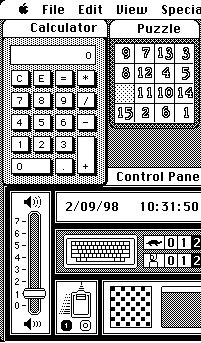
The very next day, Bill proudly returned triumphant. Overnight he'd written code to draw rounded rectangles at turbo speeds. And once rounded rectangles were as computationally cheap to draw as square-edges rectangles, they became ubiquitous on the Mac. "RoundRects" became buttons, sliders and regions in each window. They helped define the 'safe' interface of the Macintosh. And in the early days, those round beguiling corners spruiked the Mac's softer approach, luring customers away from IBM and Microsoft. And to be clear, I'm not saying that Apple were the first to use the rounded rectangle in interfaces — but they used it like no other company of the time. Today, the concept of 'round = touchable' survives and is formalized in Apple's HIG:
Visual cues, such as the arrow on a pop-up menu, help people recognize familiar elements. People learn to associate certain behaviors with specific elements based on their appearance. For example, people recognize push buttons by their rounded shape… — OSX Human Interface Guidelines
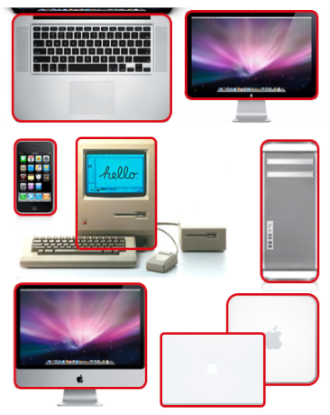
 Rounded rectangles didn't stop with software. Increasingly, the rounded rectangle has become the parti of Apple hardware design. The shape made large machines approachable and small ones pocketable. But why is it so visually appealing? Sure, there is a certain synesthesia to a shape which has no 'sharp' edges to poke yourself on, even if it's just rendered out of pixels on a screen. But what of the aesthetic? Rounded rectangles simple seem 'easier on the eye' than the square-edged variety. Why?
Time for an expert: I asked Professor Jürg Nänni, author of the exemplary Visual Perception, a book detailing our best-to-date scientific understanding of the processes involved in visual cognition. "Could rounded rectangles actually take less effort to see?"
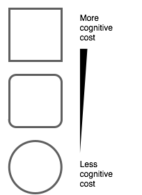
Nänni confirmed my theory: "You are absolutely right. A rectangle with sharp edges takes indeed a little bit more cognitive visible effort than for example an ellipse of the same size. Our "fovea-eye" is even faster in recording a circle. Edges involve additional neuronal image tools. The process is therefore slowed down."
 Professor Nänni is saying that rounded rectangles are literally easier on the eye. Put another way, compared to square-edged rectangles, rounded rectangles are more computationally efficient for the human brain. To me, this is a revelation. An idea that at the very least demands more investigation.
If I'm an interaction or experience designer, the machine I am optimizing for is the human. I want a design that takes the least CPU cycles for the same output. And from my current perspective, rounded rectangles provide an example of optimizing a design to reduce human visual system's CPU cost. There's only so much visual attention to spend.
What is the visual cognitive cost of…
- …a garish color scheme VS a beautiful one?
- …instantaneous disconnected movement VS smoothly animated motion?
- …one font as compared to another, in a particular context?
[UPDATE: I've switched the order of the 'animated' bullet point to save confusion]
So!
The rounded rectangle is seemingly just the tip of the iceberg in linking cognition to aesthetics, but I'm not sure how to move forward. I don't expect UI and UX designers to have their skills replaced overnight by some magic formulae. I do expect that examples like the rounded rectangle will strengthen the argument to 'go the extra mile' to make interfaces which are aesthetically pleasing. Now I want to know what other examples there might be which show that certain aesthetic elements are, in fact, simply optimizations for the human visual system.
* Jef Raskin was the biological father of the Mac
 Mac,
Mac,  Rounded rectangles,
  Visual,
  cognitive science,
  shape in
  Theories

Reader Comments (50)
Interesting that you bring up "the visual cognitive cost of ... [the] act of animating elements between positions VS instantaneous change".
I'd argue that in some cases, not animating a transition has a higher cognitive cost than animating it ("What the hell just happened? Where did X go?"). Equally, the use of animated transitions where it is not needed must surely have a cost.
As with most things in design, it's down to the designer's judgment on when to use it.
Also, it is interesting to note that in Mac OS X, only the top corners of windows are rounded, while bottom corners are not. And the latest iPod Nano has very square corners, when looking at it front-on. (But if you look at it from the top or bottom, it is an ellipse.)
Thanks Martin,
Yes — sorry I wasn't clear on that. I envision that animated elements would take LESS cognition than elements which jump between states. In fact, I'm doing some reading up on that subject currently :-)
>As with most things in design, it’s down to the
>designer’s judgment on when to use it.
With such clear decisions, a simple A/B test would quickly show which design works better. No judgement is required :-)
I think this is just fascinating.
@Martin, I had the same thought about animating vs. not animating. It would be startling to see sudden, instant changes, and would cause you to have to think about what just happened.
I think a minimalist approach would be desirable, paring down the animation as much as possible to get the point across and nothing more.
As for fonts, another great area to explore. Personally, I find the use of different fonts distracting, especially mixing serif and sans-serif.
@Ernie
I absolutely agree.
To clarify, yes this was my mistake. I *meant* to imply that simple, smooth animation would out-perform disconnected 'jumping' of icons. I mixed up the order by mistake, which implied the reverse.
@LKM Can you clarify what you mean? What kind of A/B test are you thinking of? :-)
Wonderful article Keith, Very interesting and thought provoking. Thanks.
@Keith Lang: If I wanted to see whether animating a transition is helpful or hurtful, I'd implement it both ways, deploy beta versions, and simply measure which users perform better for the task in question.
There's also the question of how long an animation should be; long enough to show the positive effects of an easily comprehensible transition, but short enough to not take more time than required. That, too, could be tested in this way.
Keith, you confused we readers because of exactly the same principles you've been discussing in this post.
You first write: a garish color scheme VS a beautiful one?
then follow up with
…act of animating elements between positions VS instantaneous change?
So the model starts with bad vs. good and we need just one example (minimal cognitive load) before we see the second comparison using the same lesson: bad vs good.
I too had to perform a double take before I stayed with "using animation to tell a story" principles I advocate when using Keynote (or Powerpoint, if you must).
Hi Les,
I totally agree — my mistake. I've fixed that now in the post.
I think a similar phenomenon as a rounded rectangle is a shaded color (gradients of color). Flat colors can be confusing. It is dificult to grasp what areas of the same color are actually the same object. The shading gives it the 3rd dimension that makes it easier to understand the objects. At least so I think.
Lately, it is very modern to keep the design of interfaces (awa web sites) very clean and minimalist. I think this trend takes away some from the usability. Buttons are just colored rectangles and so. I like simple designs, but sometimes I feel it goes too far.
Just my two pennies....
I was thinking about why rounded corners are easier to process than sharp ones, and this is just a guess, but to me the difference I perceive is a single line versus four lines. In other words, when corners are involved, the brain processes from point A to B, then B to C, and so on, until it completes a circuit. With rounded corners, the line never comes to a point, which we interpret as a stop, and so there is a single computation following the entire shape.
I think the key is in thinking of a point as a full stop (much like a period in a sentence). I am a very visual thinker, so for me the best way to illustrate the concept is to imagine driving at high speeds on a raceway. The tighter the curve the more you need to slow down, with a right angle requiring the most course correction. On the other hand, a wider curve allows you to keep up speed around a bend, and in keeping up with current trends, you can drift around such a turn without spending much effort.
Thanks Voideka,
Thanks for your thoughts — I'm working on understanding exactly this as well!
This submit button here has very sharp edges.
Just sayin' ;)
@Erik
Submit comments with caution. :-)
One reason for the apparent "ease-of-viewing" of rounded rectangles is there are no vertices to draw the eye.
Our eyes are attracted to the four corners of sharp rectangles and we have to work to keep them resting on the content in the middle.
No vertices, no distraction.
Are things with round corners more likely to be ignored?
I feel like when I look at a photograph I can ignore the blurry parts instantly and just look at whats in focus. How much is blur like rounded rectangles?
Also, the navbar on the iPhone animates a move and fade while drilling down in a tableview. Its very unnoticable, but adds to the movement of the screen.
@Adam Thanks for that tidbit. Did you have any links to that research?
@ Brad. Thats a nice theory, and I can imagine this would also be the case.
I quickly tried some tests with a gaussian blur which gave this impression.
 http://img.skitch.com/20090805-q36c61y73f78gu5rwstu5siwb7.png" alt="rectangles"/>
I realize that a real out of focus blur is different to a 2D blur, so I'll have to try that out later when I get a chance.
Though I love my Mac, the metaphor that Jesus is the Cornerstone keeps stumbling in...Can a cornerstone have rounded corners? Is ease of cognition the prime goal or like all things learned, difficulty may imply skill...Is the rounded rectangle for the child-like while the fully developed rectangle for the mature? Can a cornerstone support more building without edges?
Interesting theory. Though provoking and one that is very relevant to something I am working on. Thanks.
@AAinslie
www.twitter.com/aainslie
I always call this baby proofing web pages. You don't want sharp edges because you may poke someone eye out, thus pages like gmail and flickr have rounded their edges so it's safe for everyone to use.
Notice the iPhone's table view. The object as a whole is rounded. Individual items have square corners. There is obvious synesthesia here: to use a metaphor, a sword in a sheath can't hurt you.
(Unless someone hits you over the head with it, but that's not going to happen with a software element.)
My point is that tight-fitting square corners can be better than rounded corners in many situations. Plus, they save space.
@Alexander. Thanks — now following.
@Whit. There is definitely a big part to this which is synesthesia I think, so I very much agree.
@Benjamin, I agree that roundRects everywhere would be inefficient. Maybe relatively has some impact?
@ Sari, I totally understand. A rounded rectangle is not the right tool for the job in all circumstances. And I didn't mean to preach the Jobs' testament :-P This just happened to be a good story. In fact, there is great work being done in many places…it's just harder to find stories of those people. I'll endeavor.
Hi
Really interesting article, being a visual artist photographer and psychologist I love all elements of your exploration! I f I wanted to know the answers I would definately test my hypotheses by doing a standardized test with random participants and computer using all different versions of your designs and test for Reaction Times. You could also use the Brain Scan to first allocate parts of brain in use and RT to various stimuli. The visual pathway is a complex one and I do know that there is a coded cell for every posible line angle. There has been some interesting research done on cat's and the visual system have a look in Cognitive Research areas, journals on cognition! Good Luck and have fun thats what its all about afterall hey!!!!
...truth is, for me, rounded edges imply femininity, like the colour pink...Hard, rectangular things like tall new buildings evoke masculine thoughts...Possibly rounded edges signifies the femininization of the workforce- soon we shall see cars in pastel shades...I do think both Jobs & this article are brilliant, insofar as they are taking a closer look at something we take for granted...I love it when people stop to smell the roses, rather than just stepping on them...