Realizations of Rounded Rectangles
 Monday, July 27, 2009 at 8:48AM
UPDATE:
My rounded rectangles cognitive argument is getting a good thrashing — which is a good thing. I'm as keen as anyone to find out if the theory holds water, and if you can direct me to better research, I'd love to read it. Please share!
May, 1981
According to folklore, in the early development of the Apple Macintosh, resident graphics genius Bill Atkinson performed a miracle. He found a way to overcome the Mac's 6800 chip's math limitations thus enabling the OS to draw circles and ellipses (not just rectangles) on the screen at a blistering speed. He proudly showed this new ability off to the team. But this was not enough for the leader of the Mac team, Steve Jobs. No, the 'father of the Macintosh'* asked for one more thing.
That thing was rounded rectangles. Rectangles with rounded corners. Rectangles with the sharp bits beveled off. Friendly rectangles. Steve wanted the Mac to speedily draw ellipses, squared rectangles AND rounded rectangles. But Bill was certain this shape would be extremely difficult to draw at speed. And not even a necessary part of the Mac's drawing library. Jobs disagreed;
"Rectangles with rounded corners are everywhere!" — Steve Jobs
Steve took Bill on a walk, pointing out the ubiquity of rounded rectangles in the world around them. Eventually a rounded rectangular No Parking sign convinced Bill.
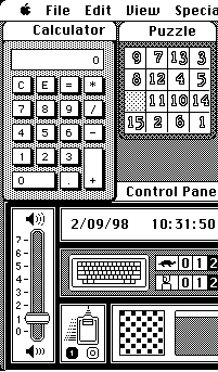
The very next day, Bill proudly returned triumphant. Overnight he'd written code to draw rounded rectangles at turbo speeds. And once rounded rectangles were as computationally cheap to draw as square-edges rectangles, they became ubiquitous on the Mac. "RoundRects" became buttons, sliders and regions in each window. They helped define the 'safe' interface of the Macintosh. And in the early days, those round beguiling corners spruiked the Mac's softer approach, luring customers away from IBM and Microsoft. And to be clear, I'm not saying that Apple were the first to use the rounded rectangle in interfaces — but they used it like no other company of the time. Today, the concept of 'round = touchable' survives and is formalized in Apple's HIG:
Visual cues, such as the arrow on a pop-up menu, help people recognize familiar elements. People learn to associate certain behaviors with specific elements based on their appearance. For example, people recognize push buttons by their rounded shape… — OSX Human Interface Guidelines
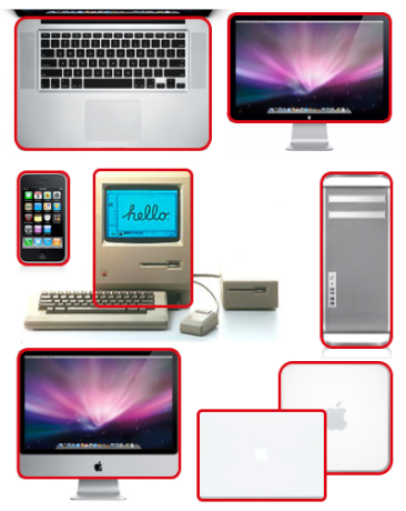
 Rounded rectangles didn't stop with software. Increasingly, the rounded rectangle has become the parti of Apple hardware design. The shape made large machines approachable and small ones pocketable. But why is it so visually appealing? Sure, there is a certain synesthesia to a shape which has no 'sharp' edges to poke yourself on, even if it's just rendered out of pixels on a screen. But what of the aesthetic? Rounded rectangles simple seem 'easier on the eye' than the square-edged variety. Why?
Time for an expert: I asked Professor Jürg Nänni, author of the exemplary Visual Perception, a book detailing our best-to-date scientific understanding of the processes involved in visual cognition. "Could rounded rectangles actually take less effort to see?"
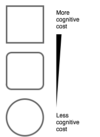
Nänni confirmed my theory: "You are absolutely right. A rectangle with sharp edges takes indeed a little bit more cognitive visible effort than for example an ellipse of the same size. Our "fovea-eye" is even faster in recording a circle. Edges involve additional neuronal image tools. The process is therefore slowed down."
 Professor Nänni is saying that rounded rectangles are literally easier on the eye. Put another way, compared to square-edged rectangles, rounded rectangles are more computationally efficient for the human brain. To me, this is a revelation. An idea that at the very least demands more investigation.
If I'm an interaction or experience designer, the machine I am optimizing for is the human. I want a design that takes the least CPU cycles for the same output. And from my current perspective, rounded rectangles provide an example of optimizing a design to reduce human visual system's CPU cost. There's only so much visual attention to spend.
What is the visual cognitive cost of…
- …a garish color scheme VS a beautiful one?
- …instantaneous disconnected movement VS smoothly animated motion?
- …one font as compared to another, in a particular context?
[UPDATE: I've switched the order of the 'animated' bullet point to save confusion]
So!
The rounded rectangle is seemingly just the tip of the iceberg in linking cognition to aesthetics, but I'm not sure how to move forward. I don't expect UI and UX designers to have their skills replaced overnight by some magic formulae. I do expect that examples like the rounded rectangle will strengthen the argument to 'go the extra mile' to make interfaces which are aesthetically pleasing. Now I want to know what other examples there might be which show that certain aesthetic elements are, in fact, simply optimizations for the human visual system.
* Jef Raskin was the biological father of the Mac
 Mac,
Mac,  Rounded rectangles,
  Visual,
  cognitive science,
  shape in
  Theories

Reader Comments (50)
@janturner
Thank for the kind words. You said "there is a coded cell for every posible line angle."
Yes — and interestingly there is some 'optimization' for horizontal and vertical lines which makes it faster to search object organized into 0º or 90º grids, as opposed to say 35º.
This may be related to our world (even pre-industrial) being defined by the vertical (tree) and horizontal (horizon) but would hazard a guess that our industrial environment makes us much more attuned/optimized to these orientations.
I don't have the research at hand, but I'll dig that up if you're interested.
Certainly, in my perception, a hard, rectangular shape, esp. in 3D form, feels more industrial, raw & unfinished, mechanistic, inanimate (rather than masculine) and a roundRect feels more personal, complete, organic, animate (and even a bit femininte, although the dominant 'feel' is of it being alive rather than inert). A roundRect is more reflective of nature, where it is rare to find perfectly straight lines (except in the case of light rays and crystals), certainly no straight edges, rectangular corners, flat surfaces or perfectly cubic shapes. Circles and unbroken curves feel 'complete and finished' in some sense, while straight lines feel 'raw and unfinished' as if waiting for a few final finishing steps.
The 'industrial' look was actually a modern styling ethos that broke away from classical styling which abjured the use of straight lines and hard edges. In some sense, then, Apple's roundRect design parti, is a postmodern throwback to the classicalfeel design era, an attempt to make technology less harsh and raw, more organic and complete.
The subject of the rounded corners is indeed an interesting food for thought...
Actually, I'm working on a thesis on the causes and implications of the act of rounding a corner in multiple disciplines, and I feel like there is some confusion in the paths taken by the different debates around it.
On one side, we have the reasons why corners get rounded (to be SHORT : technical constraints, graphical composition, avoiding stresses in structural/material contexts, avoiding discontinuities in fluids circulation, ergonomy, erosion, .. )
On an other side - I would say, behind our eyes - we have the perceptual consequences of its occurence (softness, compactness, focal attention points, object individuation(?) .. and the near-century-old researches in gestalt psychology). The reddit cogsci thread related to this post is, for that matter, a very interesting one.
The debates often slide to that side, probably because it relates to our experience of the rounded corner as ‘users’ , instead of a ‘builder’. Of course, there is the obvious bias : we’re in the post-web 2.0 online world typing on our macbooks about rounded corners, listening to our ipods, and -for some- hoping for the quick spreading of CSS3-compatible browsers to stop using javascript hacks for achieving some objectives...
But I digress : going back to the two sides mentioned, these two moments in the life of the 'rounded corners' are sometimes related (you might want to round some corners to achieve a perceptual effect, or to soften ), sometimes totally unrelated (plane windows, metallic fillets and hospitals wall corners aren't rounded for perceptual reasons). They are also the place of happy coïncidences, when ergonomy, practicality, esthetics and technical requirements do overlap in an elegant result.
But behind the scenes, there seems to be a fundamental confrontation, or rather permanent dialogue, negociation and compromise between two geometries : the angular artefact, which origins most often result of cartesian, standardized, mechanized processes (think sheets of A4 paper, stacked boxes, box-frame construction, manhattan, , fortifications, trusses, and many more..), and the constraints of time, dynamics and confrontation with the human (material fatigue and vulnerability at the angles, unergonomic sharpness, irresistible erosion, impractical discontinuities, graphical oddities -> think moleskine notepads, bunker architecture, hardigg boxes, sidewalk corners, omnipresent 'round chamfers' ...)
I'm reading those threads scrupulously, and I hope to contribute while the dust settles... meanwhile, thanks Keith for reviving the subject - already blogged by Richard Ziade some years ago. For sure, it's a fascinating one.
Just in case : hasn't that subject already been explored before ?
Hi Tristan — I'm still searching for information on the 'rounded rectangles' research. I'll certainly check out Richard Ziade's writing. If you know of any else, then please do direct me to it. :-)
I like the points you bring up. There are certainly purely 'mechanical' reasons to have rounded corners on an object, like your example of the rounded corners on concrete where the corners are the structurally weakest points. Or how in 1964 IBM spent considerable time coming to the solution of making punch cards have rounded corners to stop them from getting scruffy and jammed in the machines.
Thanks again for your well-thought-out comments. :-)
It all goes back to Φ, the Fibonacci Sequence and the golden rectangle. See page 8, "Phi on the Plane" of Scott Olsen's book, THE GOLDEN SECTION: Nature's Greatest Secret. If you create a golden spiral at each corner of a rectangle, using the Fibonacci Sequence, you come up with a rounded rectangle, which is naturally pleasing because we instinctively recognize it as a beautiful, "natural" proportion.
Credit cards companies have been issued their cards in the form of "golden rectangles" for many years -- does the use of the rounded rectangle make the cards more satisfying for the consumer to use?
Thanks Amy — I'll check out the book. Your credit card idea is a nice one.. although there's mechanical advantage to having rounded rectangles (inserting in ATMs etc) there might be some nice psychological edge. Virgin branded credit cards have one corner rounded off even more for differentiation.
To Amy : in the examples you raise, I don't clearly see the relation between rounded corners and the golden ratio. Quoting http://en.wikipedia.org/wiki/ISO_7810 :
"The proportion of sides is 1.5858, smaller than golden ratio (1.618:1)". The radius of the corners is around 3mm by my measurements.
But it raises another point : credit cards have rounded corners, but business cards do not... concerning the credit cards, that would disable the aesthetic argument as an origin of the rounded corners (it becomes an elegant consequence of a practical solution).
- who'd want to handle straight plastic corners, and insert it in his pocket ?
- easier insertion in machines + thousands of uses !
Like Keith recalls it, this also points out to the nuanced notion of ergonomy, applied to artefacts : a card must fit into an ATM and a card-holder, a screw has rounded corners so that the wrench can grab it easier, plastic moulds have rounded parts so unmoulding and fluid circulation is easier, etc etc.
...Countless examples in which rounded corners have all but "perceptual" reasons...
In all these cases, of course, as a consequence of their 'rounding', their form expresses their readiness for the planned usage (cart fitted for insertion, screw increasing the amount of directions it can get grabbed from, eased interaction with other shapes, ...).
Isn't the interpretation of this consequence a reasoning trap ? Again, I think the differentiation between the reason 'before' the rounded corner, and the reception 'after' its occurence, is a way to get out of it. Who would use gestalt psychology to trace the origins of the rounded Dogon architecture ;)
and keith : the 'rounded chamfer' of the Virgin card recalls me the sim-card of our cellulars, and the good old CPUs with their unique chamfered corner...
@Keith
No research links for you, sorry. My comment was purely my suggestion.
For any discussion of rounded rectangles in the *real* world (e.g. credit cards), let's not forget the hazzard posed by hard, plastic corners. Credit card service reps have enough to worry about without their customers cutting themselves left and right. I'm much more interested in why this has been carried over to visual interfaces.
Bruce Culver has a song called Square record...It goes, I'm gonna make a round record, Nobody wants a square record...I can't post the mp3 here, but Google it to listen...
Great article, I put a link up on our company blog and we'll see how we can stick with the rounded rectangles in the future...
I wanted to add Vilayanur Ramachandran's http://en.wikipedia.org/wiki/Bouba/kiki_effect" rel="nofollow">Bouba/Kiki effect in which there appears to be a culture-agnostic consensus on the names of different shapes. http://www.flong.com/" rel="nofollow">Golan Levin has also recently made some software that generates spline shapes (or graphemes if they can be recognized) from voice sampled from a microphone.
Given experiments like this, it is not a far stretch to understand the cognitive load of sharp corners. Perhaps it is an ancient aversion to sharp rocks? "If I impact with that, I will be injured, so I had best keep an eye on it." Something like that.
If rounded rectangles are more similar to circles and ellipses, and hence easier to process, then why don't web designers use circle or ellipse buttons? Surely they will be even easier to process, smoother than rounded rectangles, yet I wouldn't personally like them or find them better from a UI perspective. Can't imagine many would either.
We do see round buttons occasionally, particularly mimicking real buttons, but not so much as web submit buttons or otherwise. Ellipses would probably be at the level between a circle and a round box, but they are probably least used.
@ Yoav : a physical answer to your post might be right under your fingers... from the first typewriters to the current keyboards, the most used "button" has also tried to maximize the contact surface between the finger and the 'button'. We went from circles to lightly rounded squares (the radius-to-side ratio of the 'chiclet-keyboard' macbook is 1/10) ...
@Dorian: the bouba/kiki experiment (based on the Maluma/Takete of Wolfgang Köhler) is indeed a must. Reading their articles, it leaded me to a somewhat different hypothesis : a consideration on continuities and discontinuities, present in formation of shapes, phonemes, objects, music, even taste.. only to name a few perceptual examples. Rounding a polygon allows to suppress a discontinuity (whether it is an stressful sharp angle, an aggressive spatial boundary, a guttural pronunciation, a fluid circulation, etc.), thus balancing between 'taketian' and 'malumian' results.
I think a big part of rounding, especially in Apple products, is that you generally perceive higher production quality on some level. From a manufacturing standpoint, the ability to precisely round things was not always trivial. Apple demonstrates that they have the technology, and that they care enough to use it to enhance every edge of every product. If you see a modern day car, computer case, phone, etc. that is insufficiently rounded, you're left to wonder - did they prefer square edges? Or are their manufacturing capabilities outdated? Same thing goes for rounding divs with CSS. Anyone can make a sharp div on their first day. While it's not rocket science, rounding divs does immediately reflect that you have at least SOME capability and effort invested, beyond the absolute basics. For all the good discussion here about deep subconscious implications, I would wager that the decision to round is just as often about visually sellin' it, simple as chrome trim or whatever.
@ slothikun That's a good point: there is a 'culture' around rounded edges, smoothed edges and other design elements which traditionally are more costly/time consuming than just 'stamping them out'.
Thank you Yoav, tristan, Dorian, Chris, Sari for your comments and discussion. The issue certainly seems to have many overlapping influences. And perhaps it is hard to separate the chicken from the egg, so to speak.
I guess one question then is, why is the NY apple store so 'square'? Do rounded corners in transparency look ugly?
@Keith : See for yourself ;)
http://www.youtube.com/watch?v=NOi8dDmF6to
(hallways in Logan's run)
More seriously, I'd say : sculpture, Manhattan grid, crystal, faceted glass sheets, not an object, edge, no-nonsense...
and as a reminder : Apple's G4 cube...
...where a rounded transparent outer shell makes the transition between the machine and its users.
It's still interesting though, to see how Apple slowly nuances its designs away from the original 'blunt rounded corners' of the OSX 10.0>10.4 years. Just compare the corners of the ipods, macbook pros, iphones.. to their predecessors : rounding radiuses get more complex and dynamic, and sometimes sharp edges are back in the corner transition (alu macbooks).
A proof, if needed, that there is something beyond the 'rounded corners=Apple=rounded corners' idea ,)
@ tristan
ahhh, the future. Thanks tristan for the link —I'd never seen that show before.
And of course, the cube was a bit of a failure. It also had rounded corners (on one plane)
This is a fascinating post. I love the research you put into it and cannot refute the results you ascertained. (Steve Jobs is nuts!) Just looking around the room now I can see tons of furniture, accessories, appliances, etc. that SHOULD have rounded corners, but don't. I also see many examples of rounded corners in action. Very suitable.
Our application design professor (german) trashed the article as well after I sent it to him.
I commented that the giant radii are a negative example. It is more about the small, unconcious roundings. The Google buttons with only one pixel taken away at every corner. And it is all about unconcious changes, therefore lowering the cognitive cost.
He also misses to mention the humane aspect of Steve Jobs’ rounded edges theory. They do not seem dangerous, so they are disregarded by us.
He brings up an interesting point: »agled = static; rounded = interactive«.
I like that heuristic although it has its shortcomings. For example: Are input fields interactive?
It is also quite difficult to adapt to established brands: Alexa #1 Google is mainly rounded. They just can’t afford being superficially designed. Then again, #2 Facebook is almost completely angled.
Thanks Jan-Christoph for you comments.
Thanks for the link to your Application design professor, although Google Translate is not subtle enough for me to really understand their point.
I would add at least one example of a rounded input field — the search bar in the Safari browser.
:-)
www.uiandus.com, how do you do it?
I love the arguments you presented here, but would you mind explaining the advantages of having sharp edge fixtures in your interface? I see another side of a story where those blends just right depending on the surrounding elements.
@Lance, I'll turn that around and ask if you have any particular examples in mind?
Certainly it can work in the extreme:
http://www.uiandus.com/2008/08/06/announcements/synesthesia-in-design/
The
NSBezierPath bezierPathWithRoundedRect:xRadius:yRadius:method became available to developers in 10.5 only, that's about 25 years later ;-)